AOS User Guide

Welcome to the user guide for Accelerated Operations 360 (AOS 360), a project tool that allows you to share images easily and quickly to the project team. This user guide will help you get started with AOS 360 and learn how to use its features effectively. You will also find tips and best practices for creating and editing areas, managing data, and collaborating with your team. By using AOS 360, you can benefit from:
- Faster and smoother communication with your project team
- Improved quality and accuracy of your project documentation
- Enhanced visualization and navigation of your project data
- Increased efficiency and productivity of your project workflow
Language options:
Feedback and further information
You may send feedback and questions about the service via email to aos@rejlers.fi or via the service’s own feedback form (see section Settings of this guide).
Further information about the service is available at https://www.rejlersaccelerated.com/ and about Rejlers Finland Oy at https://www.rejlers.fi/.
Updates and News of the most significant changes can be found here.
Prerequisites
Before using the Accelerated Operations Service (AOS) make sure you have access to Internet and a modern web browser. Internet Explorer is not supported at all and will NOT work with the service. We recommend using one of the following browsers depending on your platform:
Desktop / Laptop:
- Google Chrome
- Microsoft Edge
- Mozilla Firefox
Apple iOS:
- Google Chrome
- Safari
Android:
- Google Chrome
Make sure your device is updated to the latest version before using the service.
Managing your user account
Accelerated Operations supports three types of login methods:
- Username/password
- Username/password plus one-time password (two-factor authentication)
- Microsoft account
Registering your account
You should navigate to https://aos.rejlers.fi/ and click on the “Register a user account” button. Enter your e-mail address into the field and click “Send request”.
You will receive an email with a password creation link. Click on it and you will be brought to the password creation page.
Minimum password requirements are:
- At least 10 characters
- One uppercase character
- One number
After you have selected your password click on “Send request”. After successfully setting your password, you can now log in to Rejlers AOS.
Changing your password
Click on “Forgot password” and follow the same procedure as you did when creating your account in section Registering your account
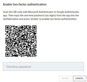
Two-factor authentication
To enhance the security of your user account you may enable two-factor authentication (2FA) where to log in you will need a one-time password that refreshes every 30 seconds, in addition to your username and password.
For 2FA you will need to download Microsoft Authenticator or Google Authenticator from your phone’s app store.
- Microsoft Authenticator at Google Play:
- Google Authenticator at Google Play:
- Microsoft Authenticator at Apple’s App Store:
- Google Authenticator at Apple’s App Store:
Steps to enable 2FA:
- Log in to AOS with your username and password.
- Click “Settings” in the upper right corner of the area selection view and “Two-factor authentication” from the drop-down menu.
- Open the Authenticator app from your phone and scan the QR code displayed by AOS. The QR code contains a key with which the Authenticator app generates one-time passwords that refresh every 30 seconds.
- In Google Authenticator: Tap the plus sign in the lower right corner of the app -> Scan a QR code
- In Microsoft Authenticator: Tap the three dots in the upper right corner of the app -> Add account -> Other account
- Follow the instruction in AOS, input the one-time password displayed by the Authenticator app and click “Enable”.
2FA is now enabled. Next time you log in to AOS you will be required to input the one-time password displayed by the Authenticator app, in addition to your username and password.
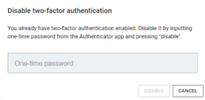
Steps to disable 2FA:
- Log in to AOS with your username, password and one-time password.
- Click “Settings” in the upper right corner of the area selection view and “Two-factor authentication” from the drop-down menu.
- Follow the instructions in AOS, input the one-time password displayed by the Authenticator app and click “Disable”.
2FA is now disabled. Next time you log in to AOS you will no longer be required to input the one-time password.
Note! If you switch your phone or otherwise lose the secret key you scanned from the QR code, please contact aos@rejlers.fi.
More information regarding the algorithm used to generate the one-time passwords: https://datatracker.ietf.org/doc/html/rfc6238
Microsoft account
If you have a Microsoft work/school account you can also log in via the “Sign in with Microsoft account” button at the service main page (if your organization permits this). We will require the permission to read your user profile (User.Read scope) to verify the email address attached to your account.
User levels
You will be assigned a user level for each area. This means that for every area you can have a different user level.
| Guest | Viewer | User | Operator | Editor | |
| 360 image & portals view/watch | x | x | x | x | x |
| Poi, item and data view/watch | x | x | x | x | |
| Markers add/edit | x | x | x | ||
| Poi, item and data add/edit | x | x | |||
| Area editor | x |
Depending on your user level in the area you will see slightly different UI. In each section of this user guide you will see the minimum required user level that the section applies to. For example, if you see “Minimum user level: Operator” it means that you will not be able to do or see the thing that section applies to unless you have at least user level Operator in that area.
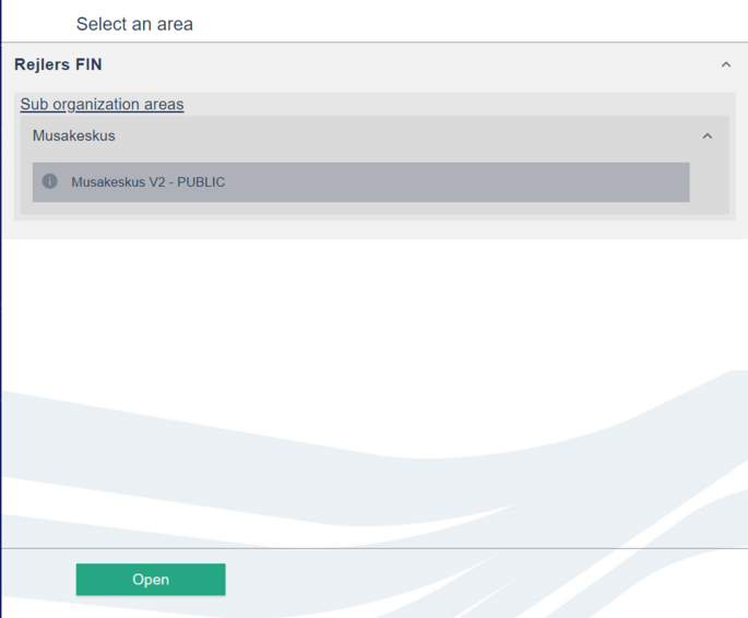
Area selection view
After you have logged into your account you will be brought to the area selection screen. From here you can navigate to any of your area from the list or from the map view.
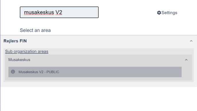
You can also search for an area with the search function.
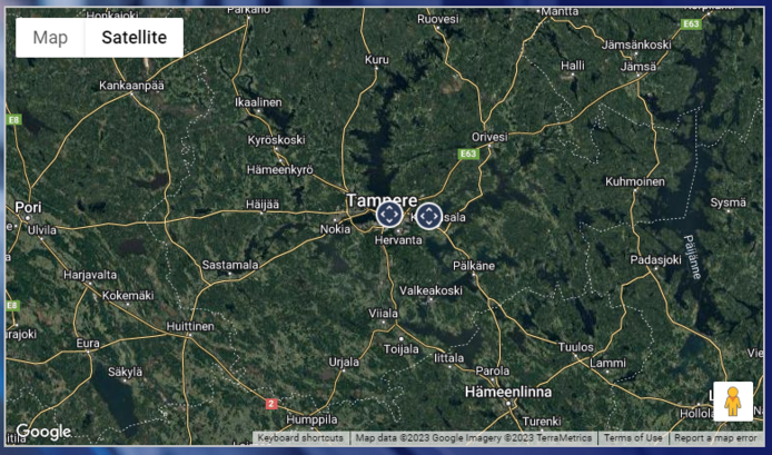
Map view
You can see all your areas scattered in the Map view. Hovering on a point will show you what area that point corresponds to.
You can click once on the node to highlight it and click “Open” from the bottom to open the area. Double clicking on a map node opens the area instantly.
List view
You can scroll through the list on the right to find the area you want to open. Areas are sorted in alphabetical order. Click on the area you want to open and then click “Open” from the bottom to navigate to that area .
Search function
You can search for an area using the search box at the top of the screen. Start typing in the search box and the areas will filter instantly.
After you open an area from the area selection view you will be brought to the main area page. If you are creating a new area the default view will be slightly different. Everything related to creating an area is explained in section Creating and editing an area.
Default page layout
On the left edge of your screen, you will see the main menu (1). In the centre you will see the layout view. Layout view is the default view after opening an area. On the bottom right you will see buttons for split view, layout view toggle and in certain cases a 3D view toggle button (2).
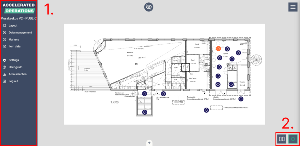
Split screen mode
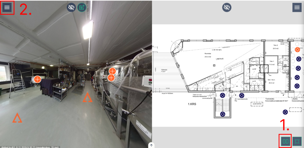
On desktop environments you will see the split view button in the bottom right corner (1). You can toggle between full screen and split screen modes by clicking on the split view button. In full screen mode you can only have one of the main views open. In split screen mode you can show either the layout view or 3D view on the right and image view on the left. While using split screen mode the main menu will be hidden behind the main menu toggle button (2).
Layout view
On the layout view you will see all the added layouts and image points. You can close the layout view from the bottom right toggle button or by clicking “Layout” from the main menu.
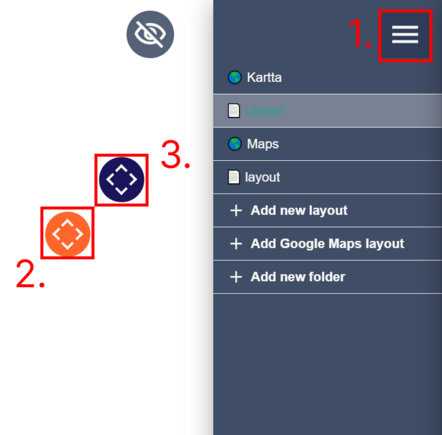
By clicking the layout view menu button (1) you will see all the layouts that have been added to the current area. The layout that is written in orange font indicates the layout that contains the currently opened image. The layout that has the background highlighted indicates the layout that is currently open in the layout view. Clicking on a layout will switch between layouts.
The orange 360 image point (2) indicates the currently opened image. Other images are marked with blue points (3). You can open an image by clicking on one of the image points.
If you want to hide or show all the points in the layout, click the icon near the top of the screen.
When the button is active (green), the points are hidden.


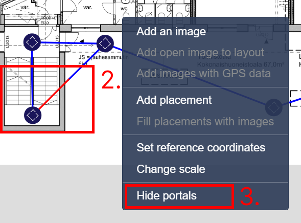
If you want to see portals that have been created between images, right-click the layout and select "Show portals". To hide the portals right-click again and select "Hide portals".
Image view
Minimum user level to see portals: Guest
Minimum user level for everything else: Viewer
In the image view you can see the currently opened image and all the Points of Interest (PoI) that have been added to it. PoI can have a different icon depending on its functionality. Here are the icons that can be found in images:
 Move in this direction
 Open Data Item
 Placement of a document/URL/Text inside Data Item
 Open Marker
Markers can also have a different icon depending on the context:

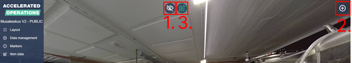
Marked locations of buttons if full screen mode is on:
- Hide/Show all PoI except movement arrows
- Open Data Management
- Toggle all placed data item datas to show in image
In split screen mode the ”Open Data Management” button will be hidden.
Controlling the image view:
Pan camera Click on an image and drag the cursor in any direction, use W, A, S, D or arrow keys
Activate PoI Click on a PoI with your cursor
Go to previous image Use R key
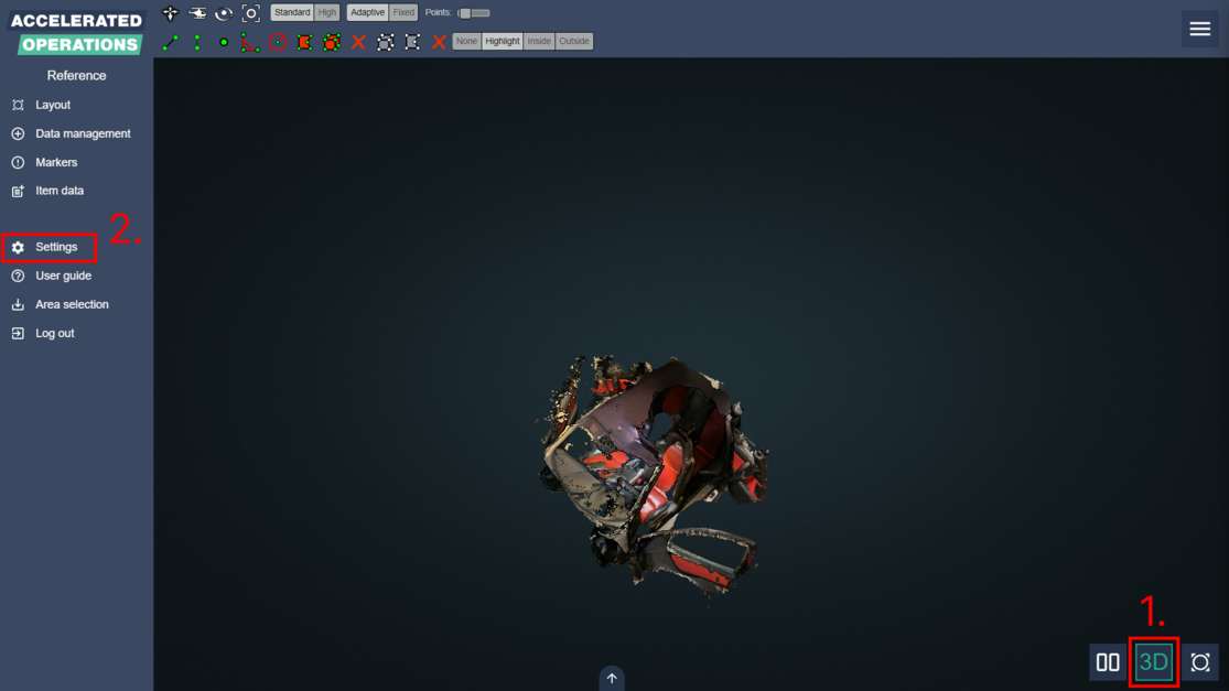
3D viewer
Minimum user level to upload pointcloud: Editor
In the 3D viewer you can view Potree pointclouds. Open the 3D viewer by clicking the 3D button in bottom the right corner and choose the pointcloud from the menu in the right (1).
If the area doesn’t yet have any pointclouds an Editor can enable the 3D viewer from the settings menu (2).
Formats and uploading
- See also: Pointcloud conversion guide
Uploading pointclouds (1) requires Editor user rights. Pointcloud zip archive contains PotreeConverter output (hierarchy.bin, metadata.json, octree.bin). Please refer to the separate pointcloud conversion guide for instructions on how to convert pointclouds to the Potree format. Contact AOS personnel at aos@rejlers.fi if you have more questions related to uploading pointclouds.
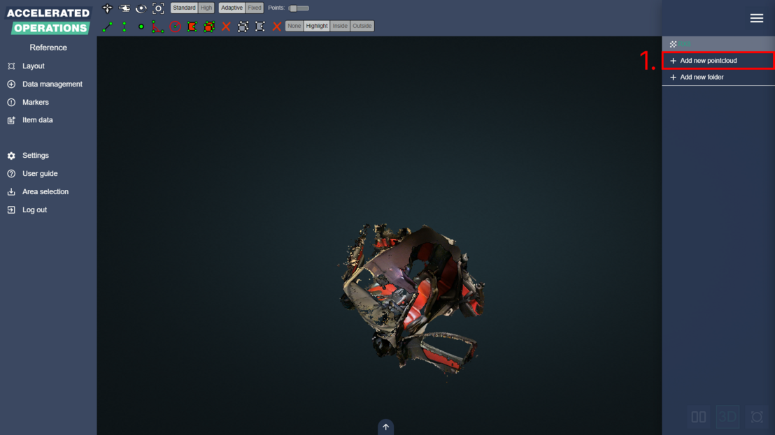
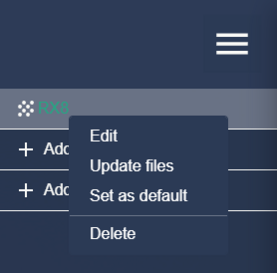
By right clicking a pointcloud’s name in the right-hand menu you have the option to edit name and folder, update the files, set the pointcloud as default and delete the pointcloud.
If a pointcloud is set as default it will be opened automatically when the 3D viewer is opened (if no other pointcloud is already open). You can also group pointclouds by creating folders.
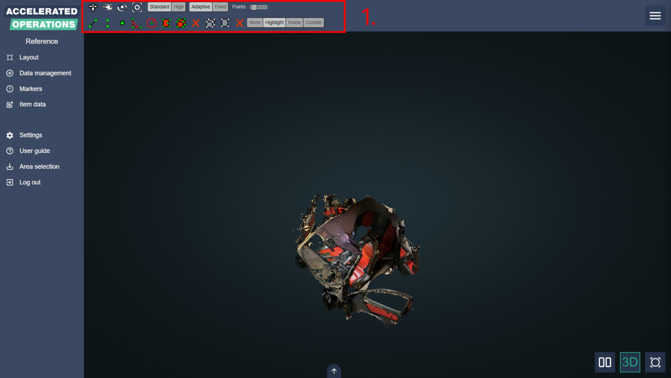
There’s a toolbar menu on top of the view, which contains following operations (1):
- Control mode
- Quality
- Measurement
- Clipping
Each of the buttons has its functionality shown in tooltip.
By double-clicking the pointcloud anywhere you can change position quickly.
Earth control (default) – Move forward, back, left and right by mouse left-click and rotate by right-click. Change zoom by rolling the mouse wheel.
Fly control – Move with keyboard arrow buttons or WSAD buttons. Change direction by mouse left-click and pan horizontally or vertically by right-click. Change speed by rolling the mouse wheel.
Orbit control – Rotate around the view center by mouse left-click and pan horizontally or vertically by right-click. Change zoom by rolling the mouse wheel.
Full extent – Go back to full cloud view.
Standard or High – Point quality.
Adaptive or Fixed – Point size.
Points – Point count.
Distance measurement – Measure distance of two or more points. Select points by mouse left-click and end measurement by right-click.
Height measurement – Measure height between two points.
Point measurement – Measure the coordinates of a point.
Angle measurement – Measure an angle.
Circle measurement – Measure the radius of a circle.
Area measurement – Measure the area and sides of a polygon.
Volume measurement – Measure the volume of a cube.
Remove all measurements
Volume clip – Clip a cube.
Polygon clip – Clip a polygon.
Remove all clipping volumes
None, Highlight, Inside or Outside – Clip mode. Highlight highlights the clipped area, Inside filters out the pointcloud around the clipped area and Outside filters out the clipped area. None hides the highlight or filter.
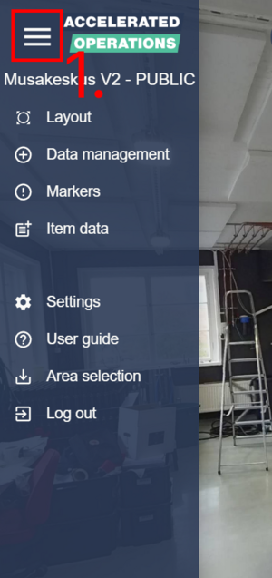
Main menu is always open on the left side of the screen in full screen mode. If split screen mode is enabled the main menu will be hidden from view and can be opened with the main menu toggle button (1).
From the main menu you can open any of the other views and either go back to the area selection page or log out.
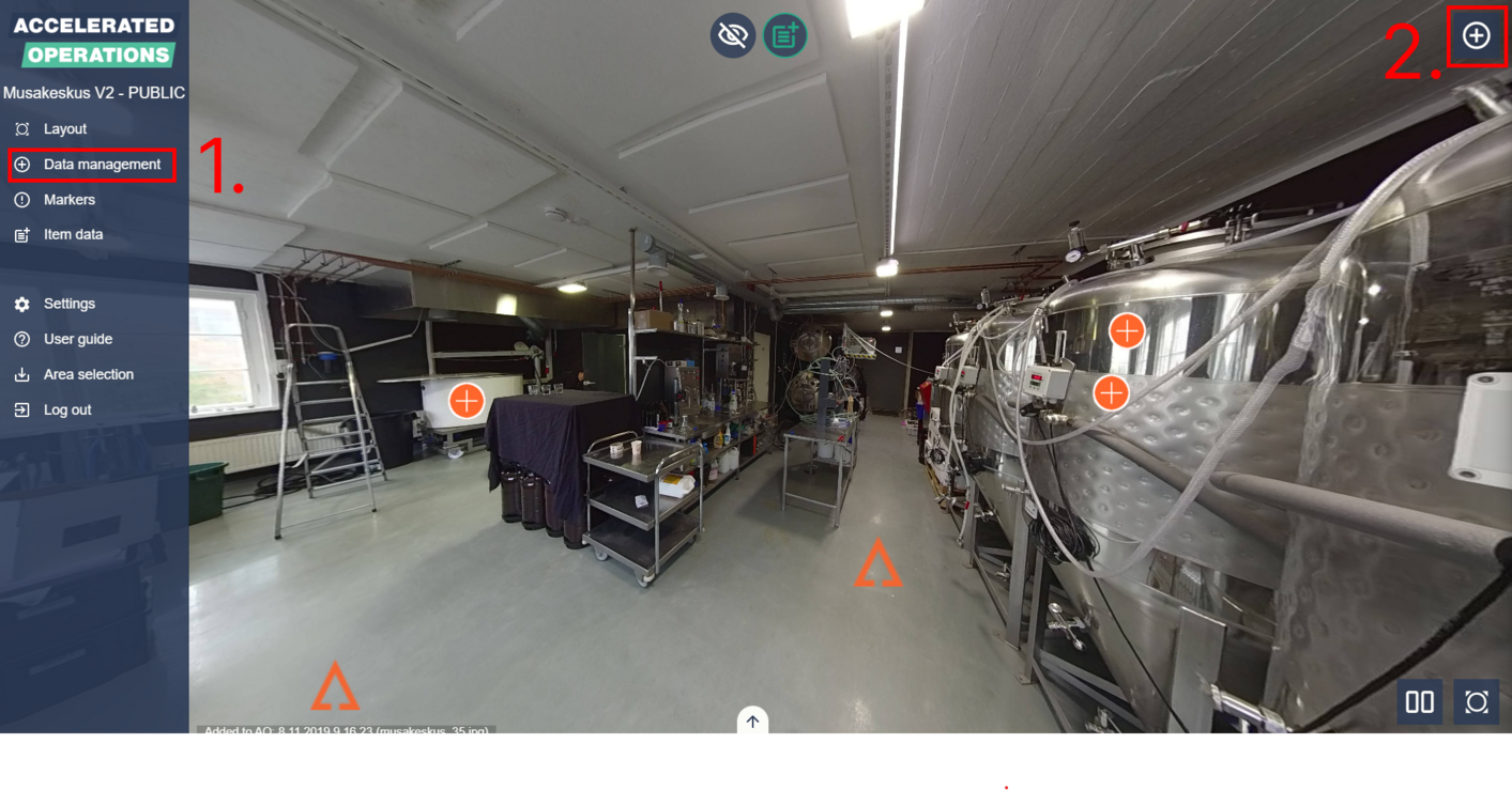
Data management
Data management contains all data items that have been added to the area in a hierarchical structure. In full screen mode data management can be opened from the main menu (1) or with the button in top right corner (2).
If split screen mode is enabled the button in top right corner will disappear.
Data items can be searched with the search box (1). After input is detected in the search box, the search controls will show up (2). If a matching data item is found the hierarchy listing will scroll to the matched item and highlight it.
If multiple matches are found you can scroll through the matches with the arrows in search controls or by pressing up or down arrow on your keyboard.
Currently selected match has orange borders (3) while other matches have light blue borders (4).
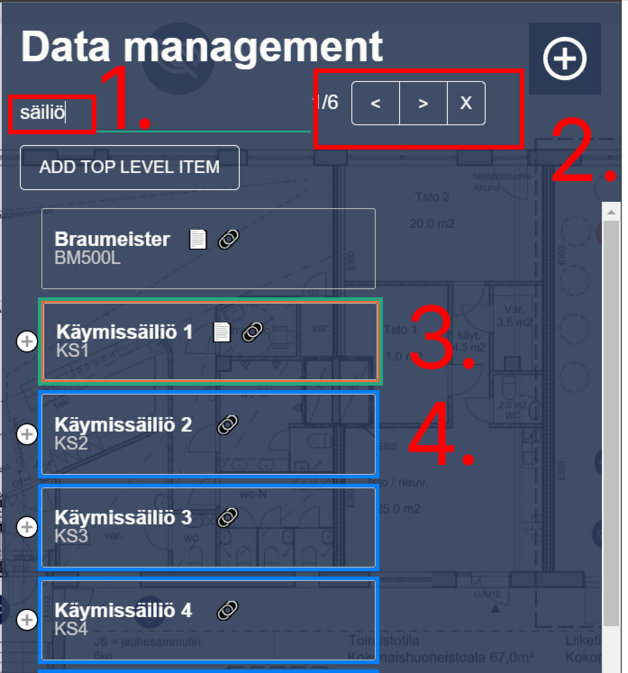
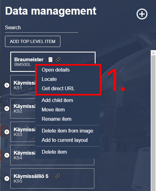
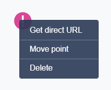
Use the plus icon to expand a data item to see its child data items. Data item can be double clicked to open data item details or single clicked with secondary mouse button to open a context menu (1). If the area creator has added the data item to an image as a PoI you can either locate the added PoI by clicking ”Locate” from the context menu or get a direct URL pointing to the PoI by clicking ”Get direct URL”.
Locating a data item will change the open image to the image that contains the PoI and rotate the camera to look at it. The located PoI will be shown as blue instead of its normal orange colour. Locating a data item will also open data item details.
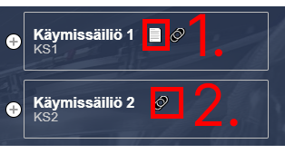
Data item can have two icons next to them. The file icon (1) indicates that the data item has some additional information added to it that can be found in data item details.
The link icon (2) means that the data item has a PoI attached to it in an image.
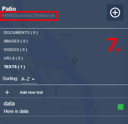
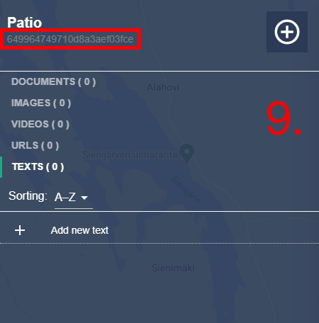
Data item details
Data item details contain all the documents, images, videos, URLs and text content that have been added to a data item by the content creators.
Data item details view is split into three different areas: header (1), data type selection (2) and content area (3).
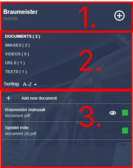
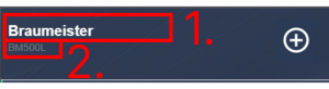
In the header you can see the hierarchy path (1) that leads to the data item. Header also contains the unique name (2) of the data item and a button to return to data management.
Any of the data item names in the hierarchy path can be clicked. Clicking a data item name will bring you to that data item in the data management hierarchy. This is useful especially when the data item details were opened from a PoI in image.
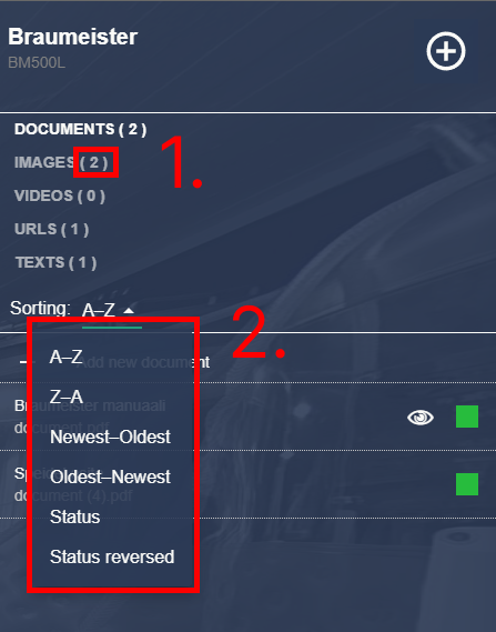
From data type selection you can select what type of content you want to view by clicking on any of the data types. Every data type has a number after the text (1). The number indicates how many items each data type contains.
From this area you can also select how you want the items to be sorted by clicking the dropdown menu (2).
Content area displays all the items that have been added under the selected data type. Clicking on a document will download it or in some cases display it in browser if it is possible.
Clicking on an image or a video will open the LightBox view. Clicking on an URL will open it to a new browser tab. Every item has one or two icons on the right side of them.
The coloured square (1) indicates the status or importance of a certain item with a traffic light system. Some items may have an eye icon (2) next to them. This means that the item has been placed in an image somewhere.
If the item has been placed you can open a context menu by pressing the secondary mouse button, which will contain the options to open or locate the item (3).
Markers
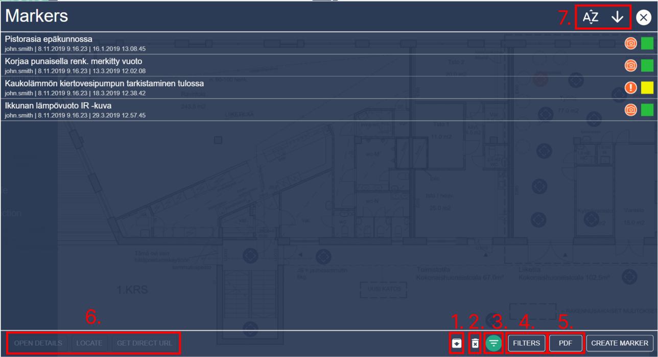
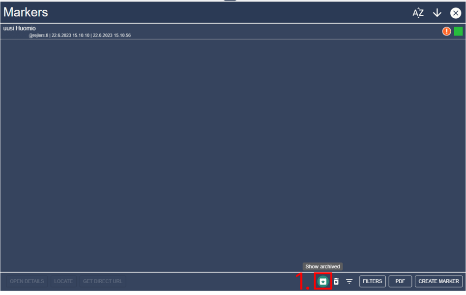
Markers view lists all the markers added to the area. Markers are always tied to a PoI. Archived markers can be seen by clicking the “Show Archived” button in the bottom right corner (1).
You can delete markers by clicking the “Delete markers” button (2). When deletion mode is enabled checkboxes will appear at the right side of the marker table. You can enable or disable filtering by using the “User filtering” button (3).
You can modify filtering of the marker list by clicking “Filters” (4). By clicking “PDF” you can generate a PDF report about the markers in the current area (5). You can select a marker by clicking.
When a marker has been selected you can open its details, locate it or generate a direct link to it from the bottom left corner (6). You can sort markers by last edit date or alphabetically with the sorting selection buttons. You can also reverse the current ordering (7).
Marker list filtering
Select “Filters” from marker list (1). You can choose the earliest and latest creation dates of markers (2) or text search the marker name or creator (3). Use filters is automatically enabled when window is opened If you want to disable filters you must click “Use filters” checkbox (4).
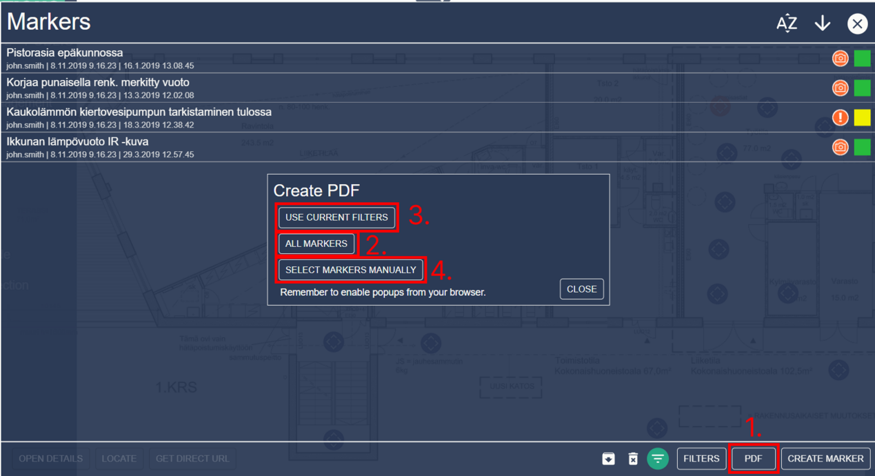
Creating a PDF report about markers
You can create a PDF report by clicking “PDF” (1) and selecting the markers that you want to include. You select to use the current filtering options (2), all markers of the area (3), or manual selection (4).
If you use manual selection, you can see which markers are selected by looking at the checkbox near the right side of a marker row. There are some limitations to marker PDF exporting.
You cannot generate a report that has more than 200 markers.
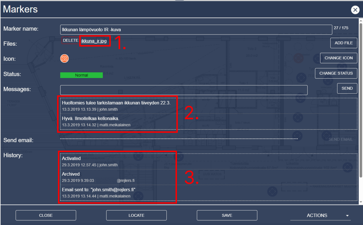
Marker details
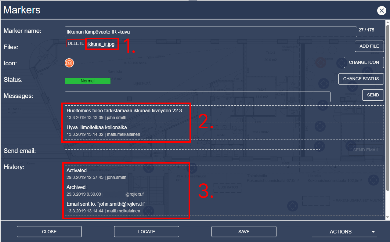
Marker details can be opened by clicking on a marker icon in an image, or by clicking on a marker row in the marker list view. Marker details page contains more information about the marker, like files (1), messages (2) and editing history (3) that you cannot see in the marker listing.
Click on the file name to download it or open the LightBox view.
Item data
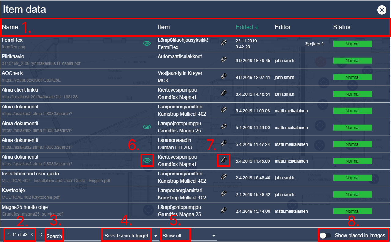
Item data view lists all documents, images, videos and URLs that have been added to any data items. Marker view can be sorted by document name, item name, edit date, editor name or status by clicking on the table headers (1).
Bottom of the view also contains pagination (2) and a search box (3). Search can be done by document name or item name by clicking the dropdown menu next to the search box (4). You can also filter the list to only show documents, images & videos or URLs (5).
Clicking on one of the rows with your primary mouse button will open item data. You can also open a context menu by clicking with your secondary mouse button.
From the context menu you can locate the item data or get a direct URL. If the item data name has an eye icon next to it (6) that means the item data has been specifically placed somewhere in an image.
If the data item name has a link icon next to it (7) that means the data item has been placed as a POI somewhere in an image. Locating the item data will either open the data item details, locate the data item POI or item data POI depending what has been placed in an image.
Select “Show placed in images” (8) to show all placed item datas in images.
Settings
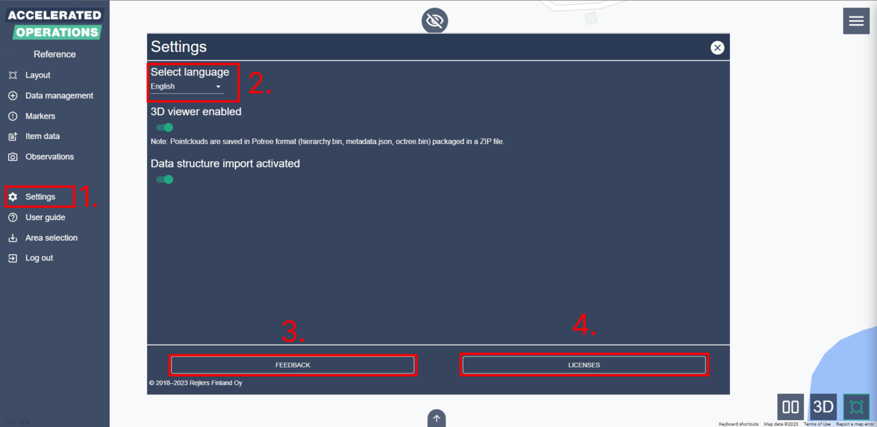
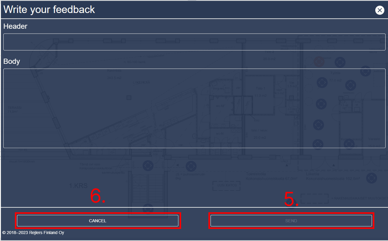
Click “Settings” (1) from the main menu to open the settings view. From the settings view you can select your language (2), give feedback or see the licenses that apply to the product.
Click on “Give feedback” (3) to open the feedback view. Click on “Licenses” (4) to open the licenses view. In the feedback view you must write a header and a body to enable the “Send feedback” button (5).
Sending feedback emails your message to the development team. Click “Cancel” (6) to go back to settings view.
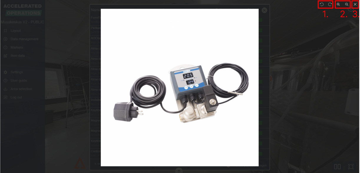
LightBox view
When you are opening an image or a video the LightBox view will open. If the content you are viewing is an image you can move it by clicking and dragging the image. You can also zoom with your mouse scroll wheel. In the top right corner of the view you will also see some buttons.
First two (1) will rotate the image. After those there are the zoom buttons (2) and close button (3). You can zoom with the plus and minus icons and reset the zoom by clicking the button between the plus and minus icons.
Creating and editing an area
Layouts
If you are creating a new area you will need to start by adding a layout. After a layout has been added the area must always have at least one layout.
Supported filetypes for layouts are JPEG, PNG and PDF. If you upload your layout as an image, we recommend a maximum resolution of around 3000x3000 pixels and a maximum image size of 3 megabytes.
Maximum resolution of the image is limited to 4000x4000. Larger layout images might slow down some devices.
Adding an image layout
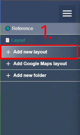
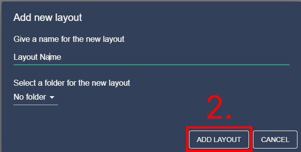
Open the layout view by clicking the icon in bottom right corner or from the main menu. Open the layout menu by clicking the top right corner icon. If you are creating a new area the layout menu will be automatically opened. Click on “Add new layout” (1) and then find and load your layout from your computer. After this you can give a name for your new layout and add it to a folder if you want. If you select “Create new folder” from the folder selection you can then also input a name for the new folder. When everything has been set click on “Add layout” (2).
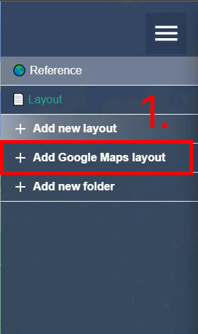
Adding a Google Maps layout
Open the layout view by clicking the icon in bottom right corner or from the main menu. Open the layout menu by clicking the top right corner icon. If you are creating a new area the layout menu will be automatically opened.
Click on “Add Google Maps layout” (1). Give a name for your new layout and add it to a folder if you want. If you select “Create new folder” from the folder selection you can then also input a name for the new folder.
When everything has been set click on “Add layout” (2).
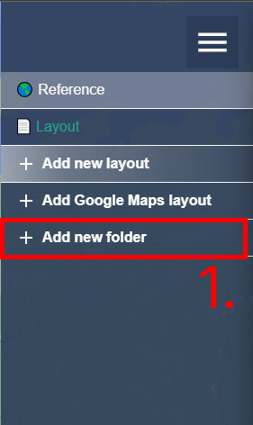
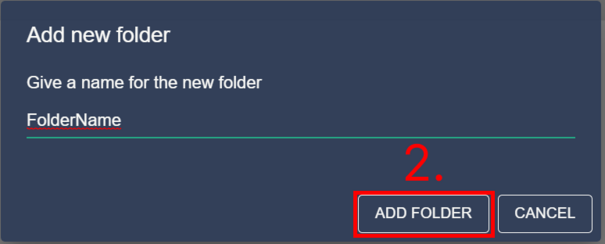
Adding a folder
You can add folders for layouts by clicking “Add new folder” in the layout menu (1). Then give a name for the folder and click “Add folder” (2). You can also create folders when adding a layout.
Folders allow you to group layouts together for example by date or floor.
Editing a layout or folder
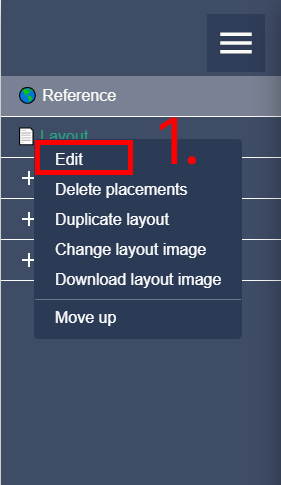
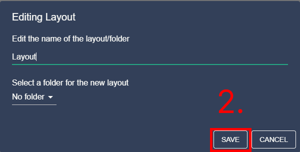
Open the layout menu and right click on a layout or folder name to reveal a context menu. Click on “Edit” (1). From the edit menu you can change the name of the layout or folder.
If you are editing a layout you can also add/change/remove the folder of the layout. Click on “Save” (2) to save changes. Note that folders cannot be put inside another folder.
Duplicating a layout
Open the layout menu and right click on an image layout or Google Maps layout to reveal a context menu.
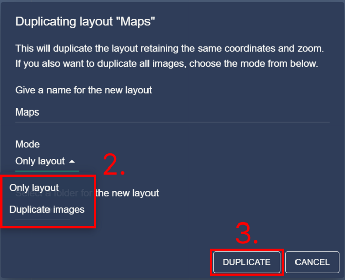
Click on “Duplicate layout” (1). From the following dialog you have the option to give a name for the new (duplicated) layout.
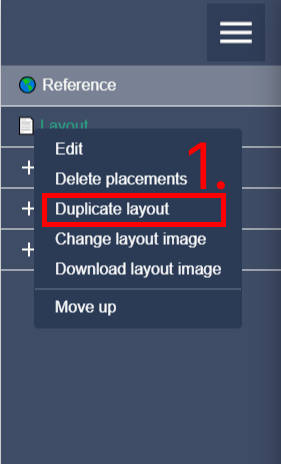
On an image layout, you have the option to duplicate only the layout or create placements of all the images or also duplicate all images (2). Click on “Duplicate” (3) to duplicate the layout.

On a Google Maps layout, the layout will be duplicated retaining the zoom and the coordinates. You also have the option to duplicate all images (2).
Google Maps layout doesn’t currently support placements. Click on “Duplicate” (3) to duplicate the layout.
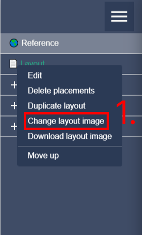
Changing the layout image
Open the layout menu and right click on an image layout to reveal a context menu. Click on “Change layout image” (1). Select a new layout from your computer. After selecting the new layout, it will appear in the layout view.
You will most likely have to move the image points to their new locations or change the scale of the layout.
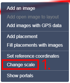
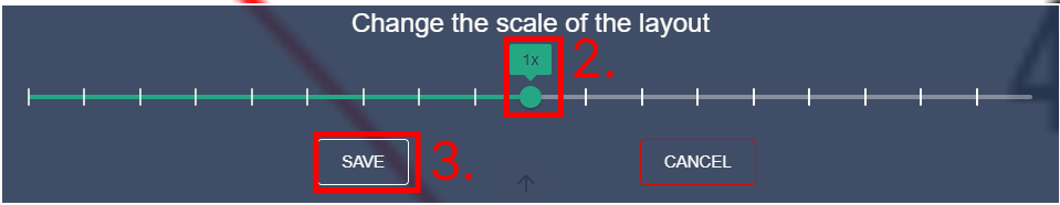
Editing image layout scale
You can set the scale of an image layout by right clicking on the layout image and selecting
“Change scale” (1) from the context menu. Then use the slider (2) to change the scale and click “Save” (3) to apply the changes.
Changing the scale of the layout will change the size of the points that have been added to the layout.
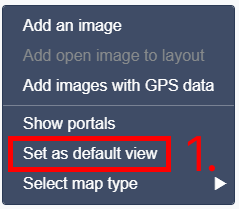
Setting the default view in Google Maps
You can set the default view where the Google Maps layout opens to after selecting it from the layout menu. Right click on a Google Maps layout to open a context menu and click ”Set as default view”.
This will save the current center point of and zoom level of the map and whenever the layout is clicked from the layout menu the map will move and center itself to the set location.
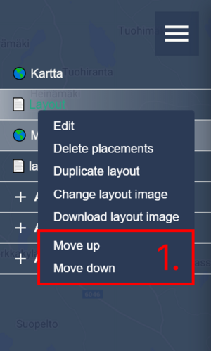
Changing the layout or folder ordering
You can change the order of the layouts and folders in the layout menu. Right click on a layout or a folder to open a context menu and select ”Move up” or ”Move down” (1).
This will move the selected item up or down in the ordering.
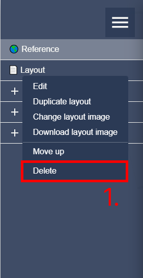
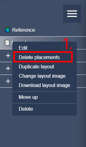
Deleting a layout or folder
Open the layout menu and right click on a layout or folder name to reveal a context menu. Click on “Delete” (1). Note that ONLY empty folders or layouts with no points can be deleted.
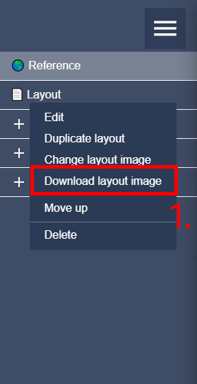
Downloading a layout
You can download a layout image to your own computer by right-clicking the layout in the menu and selecting “Download layout image” (1).
Placements
Placements are a tool that can be used to add the locations of images beforehand. Placements can be added before taking the images and then used as a guide to where to take the images and in which order.
This makes uploading the images to correct locations easier later. You can also add placements with mobile devices while taking the images at the location to serve the same purpose later.
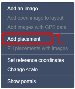
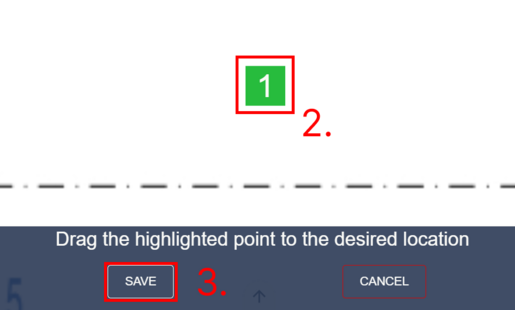
Adding a placement
Right click on a layout to open a context menu and select “Add placement” (1). Then drag the placement point (2) to the correct location and select “Save” (3).
On mobile devices you can long press the layout and then immediately drag the placement to the correct location.
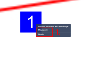
Editing a placement
Right click on a placement point to open a context menu (1). Click “Move point” to move the placement to a new location by dragging. Click “Delete point” to delete the placement.
All placements of a layout can be deleted at once from the layout menu (1).
Images
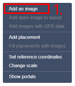
Adding one image
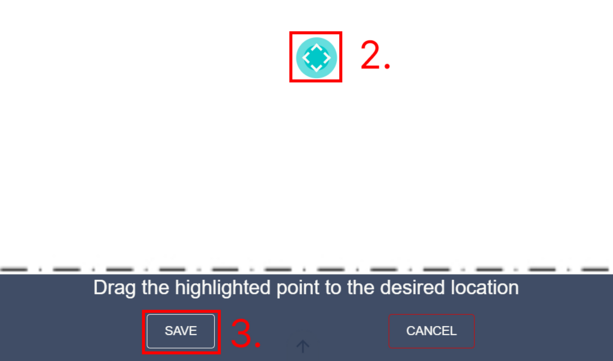
Right click on the layout to open a context menu and then select “Add an image” (1). Select and load the image from your computer. You can then move the image point (2) around by dragging it.
After the image point is in the right place click “Save” (3). Your image will be sent to our processing server and added to the layout.
If there are placement points you can click on a placement point and then select and load an image from your computer. This will convert the placement point to an image point.
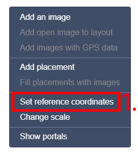
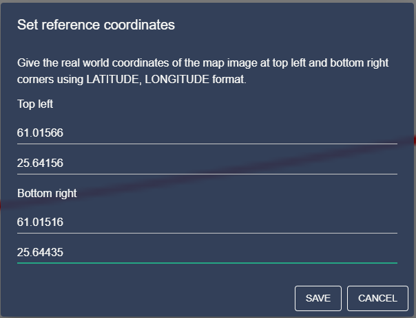
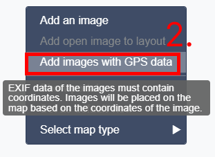
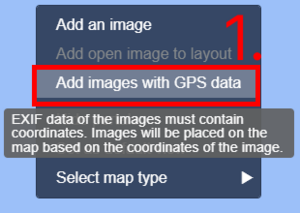
Adding images with GPS coordinates
Right click on a layout and select “Set reference coordinates” (1). Reference coordinates should be pointing to the upper left and lower right corners of the layout image.
When the reference coordinates have been set you can upload images with GPS coordinates in the EXIF data and the images will be automatically placed. You must use the “Add images with GPS data” (2) button if you want to place the images automatically.
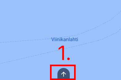
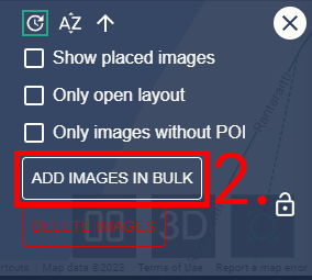
Adding multiple images for editing
Open image menu from the bottom (1) and click “Add images in bulk” from the right side of the listing (2). Select all the images you want to add from your computer.
After selecting all the images, they will be processed and added to the image menu ready to be used.
Adding and automatically placing multiple images to Google Maps layout
If you have multiple images that contain coordinate data, you can add them in bulk to a Google Maps layout. Images will be automatically placed in their respective coordinates.
Open the layout view and right click a Google Maps layout to open a context menu. Click “Add multiple images” (1) from the context menu and select the images you want to add from your computer.
After the selection the images will be uploaded and placed automatically.
Replacing placements with images automatically
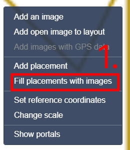
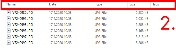
Placements can be replaced with images automatically by right clicking the layout and selecting “Fill placements with images” (1). The images you select will fill the placements starting from number 1.
The order of the images is as seen in the selection dialog regardless of the selection order. For example in Windows operating systems, you can change the ordering by using the sorting options in File Explorer (2).
If you select more images than placements, the extra images will be dismissed. If you select less images than there are placements the placements will be replaced until there are no more images.
Editing an image
Right click on an image point to open a context menu (1). Click “Move point” to move the image to a new location by dragging. Note that you cannot delete the last available image in the area.
The area must always have at least one image after one has been added.
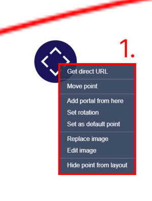
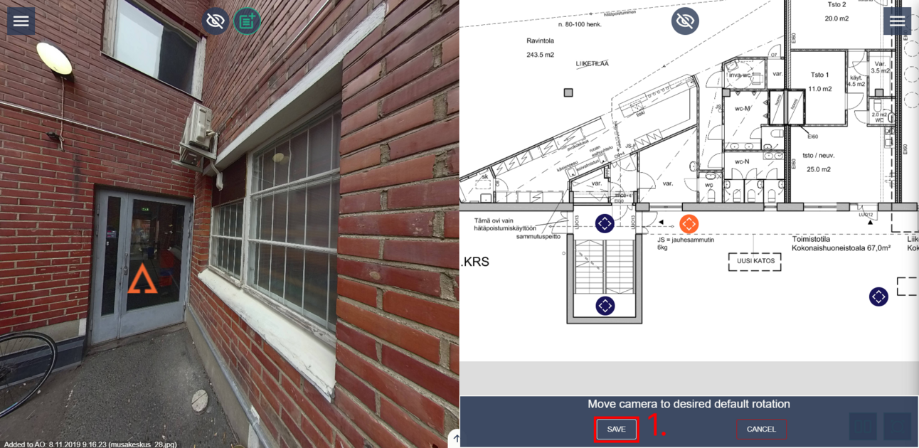
Click on “Set rotation” to set the default rotation of the image. Default rotation will be applied when the image is opened from the layout or if it is the default point of the area.
When “Set rotation” has been clicked you will be set in split view. Rotate the image to the correct rotation by dragging on the image vie then click “Save” (1).
Click on “Set as default point” to set the image as the default image that is opened when the area is loaded.
Hiding/removing images from the layout
Sometimes it is useful to hide already placed images from the layout. This option replaces the old “360 extension image” concept. Hidden images can still contain portals and other PoI types unlike the old “360 extension”. If you want to add portals to your image place it on the layout and create the portals to it like normal.
When the portals have been created you can hide the image. Right click on an image point and select “Hide point from layout” (1). This will remove the image point from the layout.
If you want to add the image point back or move it to another layout you can find the image in the image menu. Hiding the point will not remove any created portals or other PoI types that have been added to the image. Images can be restored using image menu.
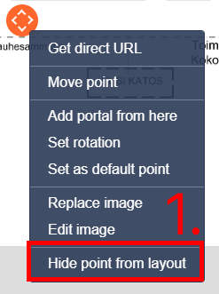
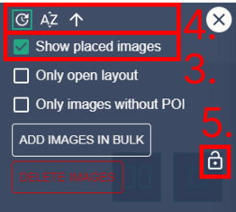
Image menu contains all the images that have been added to the area and shows if they have been placed in a layout or not. You can preview and add images to a layout straight from the image menu. All user groups can view the images of the image menu, but only a editor group can add images.
To open image menu click the button near the bottom of the screen (1). Images that have been placed will have their layout name under them (2).
To show images that have already been placed in a layout enable the “Show placed images” option in the layout menu (3). You can also filter only the images that have been placed in the current layout by enabling “Only open layout”.
You can sort the list by image name or upload date in ascending or descending order (4). If you want to lock the image menu open at all times you can lock it by pressing the lock button (5).
Image menu is a useful tool in the area creation process. You can add images in bulk and deselect the “Show placed images” option.
You can then preview and place each image from the image menu and after the image menu is empty you will know that all the images have been placed.
Placing images from the image menu
The image that is currently opened in the image view will be circled with orange borders in the list. You can open an image by clicking on it in the image menu.
If the image that you are currently previewing has not been placed in a layout, you can place it on the open layout by right clicking on it from the image menu and selecting “Add to this layout”. You can also right click on the layout view and select “Add open image to layout” OR double click the layout. If you select “Add open image to layout” option from the layout, the new point will be placed where the click was.
If you select “Add to this layout” from the image menu the new point will be placed in the center of the layout.
Moving images from layout to another layout
Open the layout that you want to move the image to. Right click on the image in the image menu and select “Move to this layout” from the context menu.
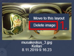
Deleting images
You can delete an image by right click on it and then selecting “Delete image” from the context menu (1). If you want to delete multiple images simultaneously then click “Delete images” on the right side of the menu (2).
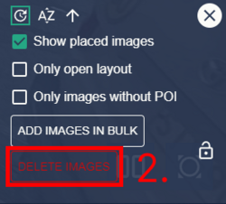
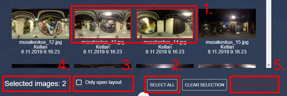
In the image deletion menu you can select images by clicking on them (1) or select all images by clicking the “Select all” button (2). You have the option to list only images of the open layout by ticking the “Only open layout” checkbox (3).
Selected images will have a red border around them (1). In the bottom of the view you can see how many images have been selected (4).
When you have selected the images to be deleted click “Delete selected images” from the bottom right (5). All data related to the images like portals, POIs and points will be deleted as well.
Portals
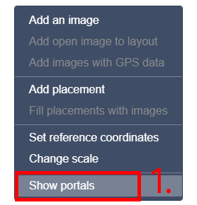
Portals are a type of POI that allows movement between images. Portals should be added to ease the use of the area, but they are not necessarily required. When you are editing or adding portals, we recommend that you use the “Show portals” function. Enable “Show portals” by clicking on the layout image and selecting “Show portals” (1) from the context menu. This will add blue lines between images that have portals.
If an image has a portal leading to it but not back it will have a red line instead (2). Click “Hide portals” from the context menu (3) to hide the blue lines and arrows.
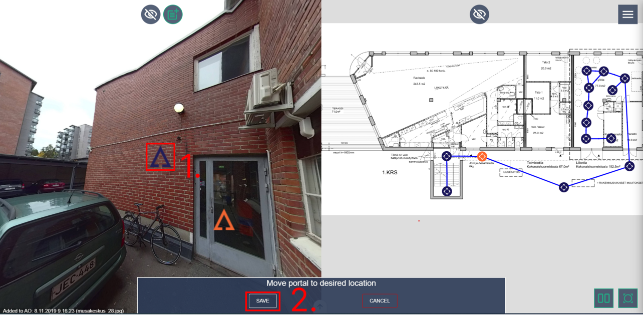
Adding a portal
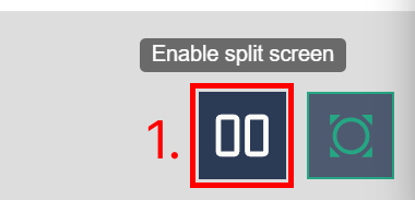
We recommend that you use the split view to add portals. This makes the portal adding process faster and easier. Enable split view by clicking the split view button from the bottom right corner (1).
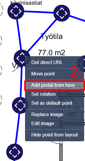
Right click on an image point where you want the portal to start and select “Add portal from here” from the context menu (2) OR double click the image point. Then select the destination point by clicking on an image that the portal leads to.
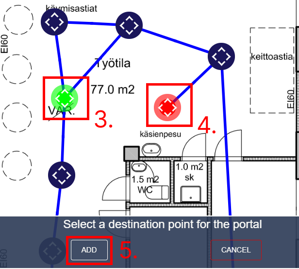
Starting point is coloured green (3) and the destination point is coloured red (4). When starting and destination points have been selected click “Add” (5). You can also press space bar on your keyboard to advance.
Note that you can add portals between layouts by selecting a different layout while in the destination point selection phase. You can use the W, A, S and D buttons on your keyboard to rotate the image when placing a portal or setting rotation.
After clicking “Add” or pressing space bar a blue portal icon (1) will appear in the image view. The portal icon will be centred in your image view. Move the portal icon by rotating the image.
When the portal icon is in the correct location and click “Save” (2) or press space bar. We recommend that you place the portal icon near the position of the destination image’s base.
When the portal icon has been placed you will be taken to the destination image. Move the camera in the destination image so that it seems like you moved to it by walking. This means that most likely the previous image location should be “behind” you.
If the destination image is close to a wall or a corner, we recommend that you rotate the view to look like a person would have walked there.
So, in a corner rotate the view around the corner or when facing a wall look at the previous point or a point of interest instead. Click “Save” or press space bar to advance.
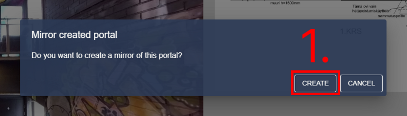
Usually when creating portals, you will want to add a portal back to the starting image. If a portal that leads back to the starting image does not exist, you will be asked if you want to create a portal that leads back to the starting point called a “mirror portal”. Click “Create” (1) or press space bar to create the mirror portal.
A blue portal icon will be placed in the previous destination image and you can follow the same procedure as you did when adding the previous portal icon.
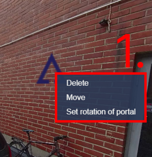
Editing portals
To move or delete a portal right click on it to open a context menu and then click “Move” or “Delete”. If you click ”Set rotation of portal” or "Move" you will be brought to the rotation setting section of the portal add procedure (1).
Adding text and labels to images using third party software
It is possible to add your own annotations to the images, such as adding text or drawing instruction arrows. These edits can be made using Paint 3D, which is standard software on Windows 10 computers.
Below are instructions on how to use the program, the most important thing is to save the files in JPEG format so that they can be read by the Accelerated Operations Service.
Edited images are saved in the same way as unedited images in the Accelerated Operations Service.
Paint 3D
Microsoft Paint 3D is a user-friendly graphics editing program that allows users to create, edit, and manipulate 2D and 3D images. This documentation will guide you through the essential usage of the program, including opening and saving files in JPEG format, using the text tool, and utilizing color brushes.
Opening and Saving a File in JPEG Format
To open a file in Microsoft Paint 3D:
- Launch the program by clicking on the Paint 3D icon or searching for it in the Start menu.
- Click on the "File" tab in the upper-left corner of the screen.
- Select "Open" from the dropdown menu.
- Locate and select the desired file from your computer's directory.
- Click the "Open" button.
To save a file in JPEG format:
- Click on the "File" tab in the upper-left corner of the screen.
- Select "Save As" from the dropdown menu.
- Choose a location on your computer where you want to save the file.
- Enter a name for the file.
- In the "Save as type" dropdown menu, select "JPEG (*.jpg, *.jpeg)".
- Click the "Save" button.
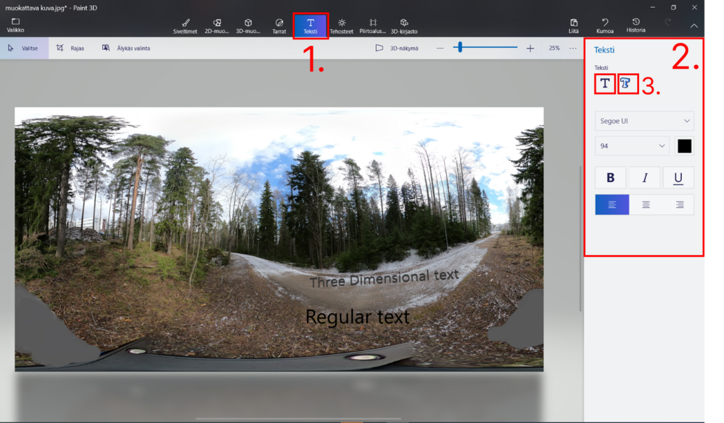
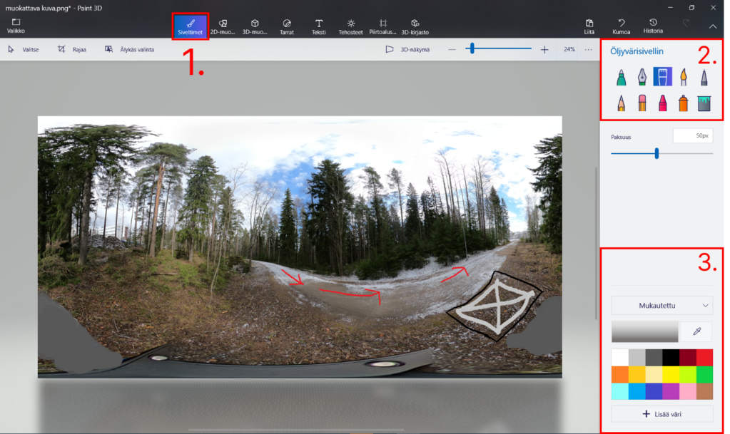
Using the Text Tool
- Click on the "Text" button in the toolbar at the top of the screen (1).
- Adjustment menu can be found on the right side (2).
- To enable the text field, user needs to chose either regular or 3D text format(3).
- Type the desired text into the text box.
- You can resize or reposition the text box by clicking and dragging its handles.
Using Color Brushes
- Select the "Brushes" button in the toolbar at the top of the screen (1).
- Choose a brush style from the options displayed (2).
- Click on the color palette located in the right sidebar to select a color for the brush (3).
- Click and drag your cursor on the canvas to draw with the selected brush and color.
- To change the brush size, use the brush size slider located in the toolbar.
Useful shortcuts
Ctrl + N: Create a new project.
Ctrl + O: Open an existing project.
Ctrl + S: Save the current project.
Ctrl + Shift + S: Save the current project with a new name.
Ctrl + Z: Undo the last action.
Ctrl + Y: Redo the previously undone action.
Ctrl + X: Cut the selected object or text.
Ctrl + C: Copy the selected object or text.
Ctrl + V: Paste the copied or cut object or text.
Delete: Delete the selected object or text.
Editing the content of an area
Data management
Adding a top level data item
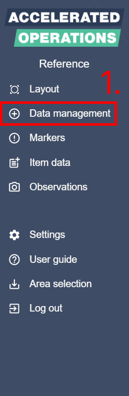
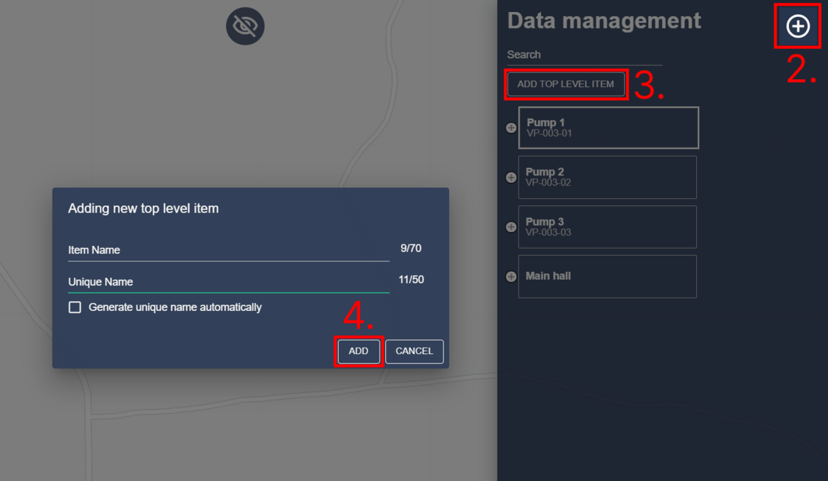
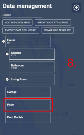
Open the data management view by clicking “Data management” in the main menu (1) or by clicking the data management button in top right corner (2). Click “Add top level data item” button (3) from the right side and the dialog will pop up.
Input a name for the data item e.g. “Pump”. If you have a technical/unique name or ID for the data item you can add it to the second field.
We recommend that you tick the “Generate unique name automatically” checkbox if you are not sure about the unique name. Data item name and unique name can be changed later if needed. Click “Add” (4) when you are ready.
Adding a child data item
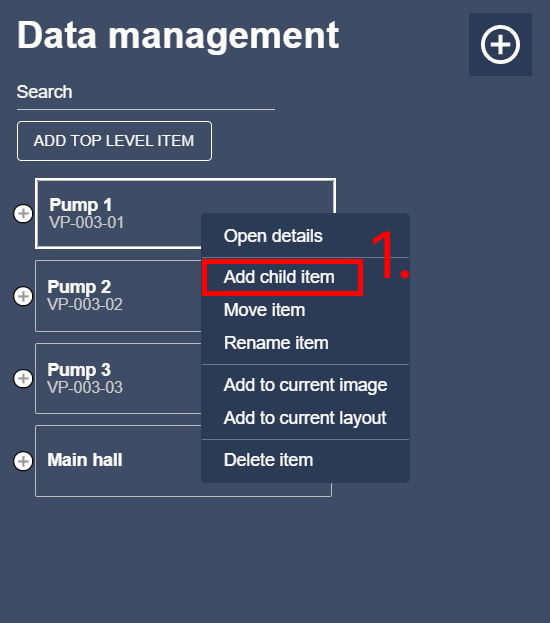
Right click on a data item in the data management view to open a context menu.
Then click on “Add child item” (1). This will open the data item add dialog.
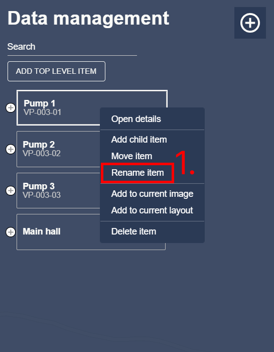
Renaming a data item
Right click on a data item in the data management view to open a context menu. Then click on “Rename item” (1). This will open the data item rename dialog.
Data structure import and export
You can use data structure import/export tool to make changes to the data structure contained in data management. Data structure edits will be made in Microsoft Office Excel.
You can import data to Excel from an external source and then edit it to be compatible with Accelerated Operations.
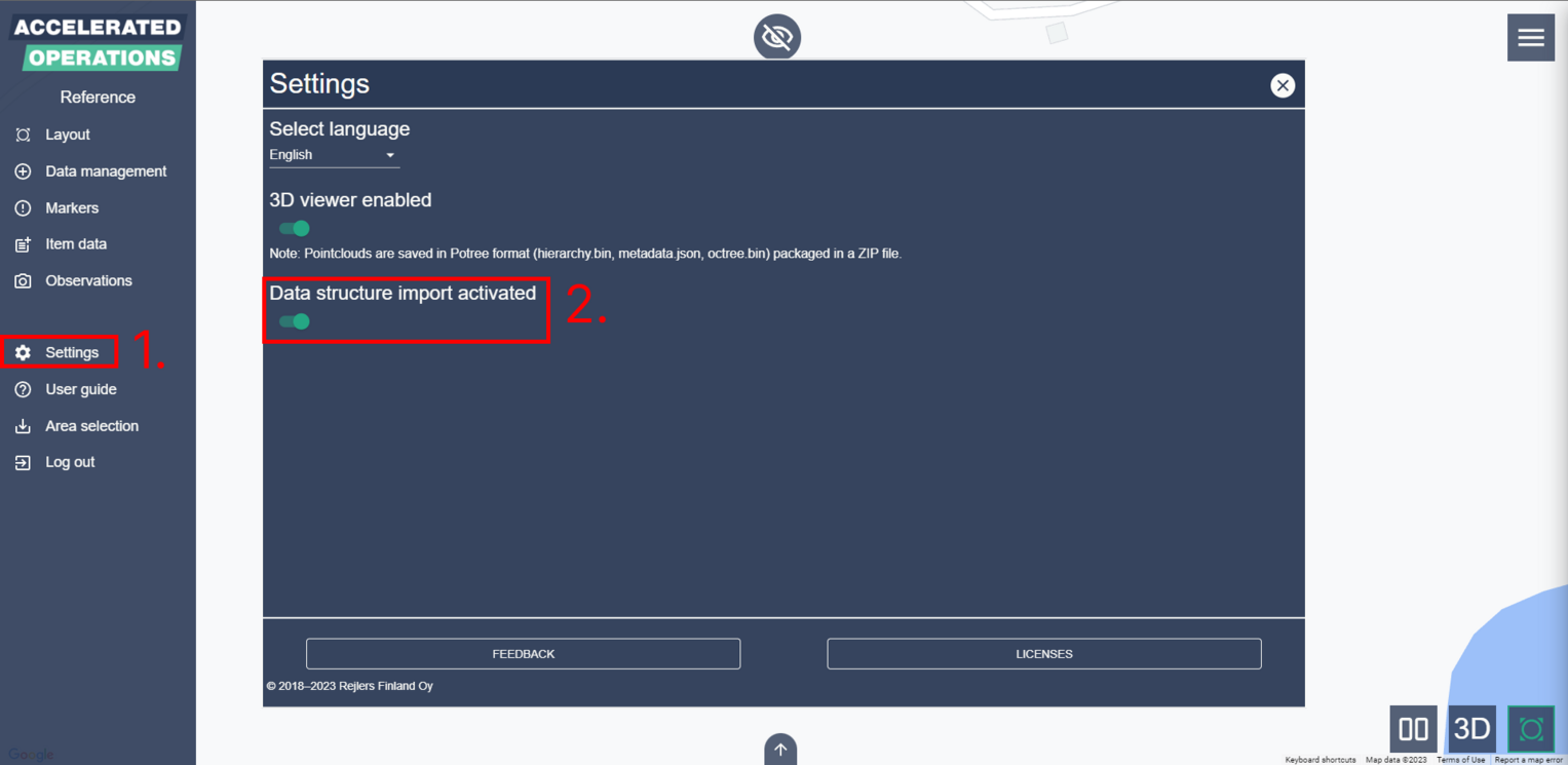
Enable data structure import and export tool from “Settings” menu. Click “Settings” from main menu (1) and activate “Data structure import” (2).
Data structure creation and contents
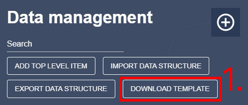
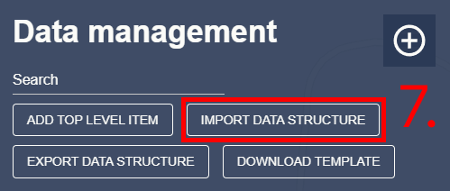
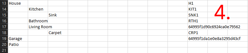
Open data management and click “Download template” (1). After you have downloaded the template open it in Excel. Don’t convert the file type if Excel asks you to do so.
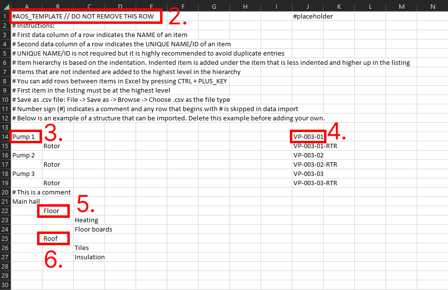
The data structure template contains an example structure that can be used as a base for your own structure.
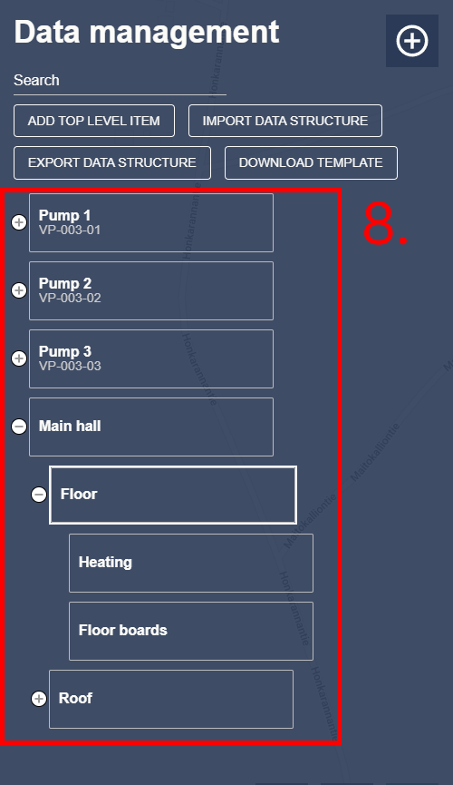
At the top of the data structure template you will see instructions on how to use it and a few example items.Do not edit the first row of the template (2).
You can add comments to the structure by prefixing the row with a hashtag (#). The structure is similar to the one that you can see in data management.
First cell that contains text in a row is the name of an item (3). The second cell that contains text is the unique name of an item (4). We recommend that you always give a unique name to an item.
Importing an item without a unique name can cause problems in certain scenarios. Hierarchy of the items is determined by the indentation. For example the item “Floor” (5) is an child item of “Main hall” and so is the item “Roof” (6).
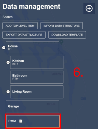
After your data structure is ready save the file as .csv type. After that you can return to Accelerated Operations and click “Import data structure” (7).
Select the data structure file that you created and it will be imported into data management (8).
Data structure export and editing
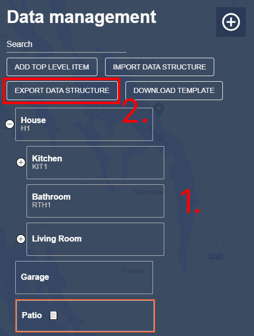
Let us examine an example structure (1) and edit it. This example structure has two top-level items and a few child items. Notice that two of the items do not have a unique name added.
Click “Export data structure” (2) and save the file to your computer. Open the saved file in Excel. You will see that the items that did not have unique names have been assigned an identifier (3).
Do not edit these identifiers under any circumstances.
You can edit the structure in Excel as you wish, but do not ever change any unique names of existing items since doing so will replace that item with a new one and all data will be lost.
Please notice that if you remove an item from the structure it will be permanently deleted after importing the file back to Accelerated Operations. You can add a row in Excel by selecting a whole row and using the key combination ctrl + plus.
Here you can see the changes made in this example (4).
After you are done editing save the file as .csv type. Return to Accelerated Operations and click “Import data structure”. Select the data structure file that you created and the existing structure in data management will be updated.
It is important to note, that if you are making changes you must always use the file generated using “export data structure”. For example after importing you must export data structure before making any more changes. Exporting data structure ensures that the unique names of items are correct. If you import a structure with wrong or missing unique names, you will lose data.
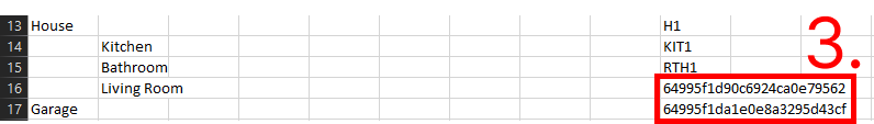
As an example lets modify the earlier existing structure. Note that the file that is already transferred to Accelerated Operations is missing the programmatically generated unique names (5).
As a result, items missing a unique name are added as a new item and the old one is deleted, since the unique name of the existing item identifier is not present in the imported structure. In this case, the data of the old item is also deleted! (6) (7) (8) (9)
Note how in the re-imported file the data has disappeared from the layer (8) and the unique identifier has changed (9).
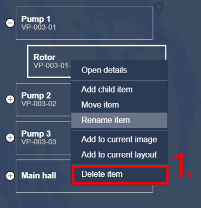
Deleting a data item
Right click on a data item in the data management view to open a context menu. Then click on “Delete item” (1). This will open the data item deletion dialog.
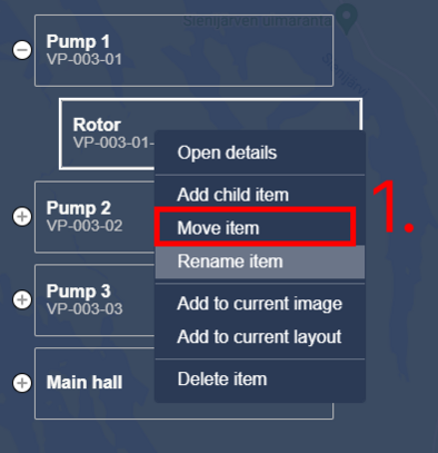
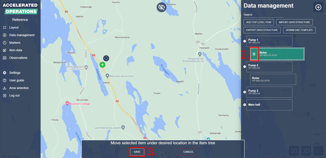
Moving a data item in the hierarchy
Right click on a data item in the data management view to open a context menu. Then click on “Move item” (1).
This will activate the selected data item to be moved and a handle will appear next to it (2). Click and drag from the handle to move the data item.
Moving a data item will also move its children. You can move the data item as the child of any other data item or move it to the top level. Click “Save” (3) on the bottom to apply changes.
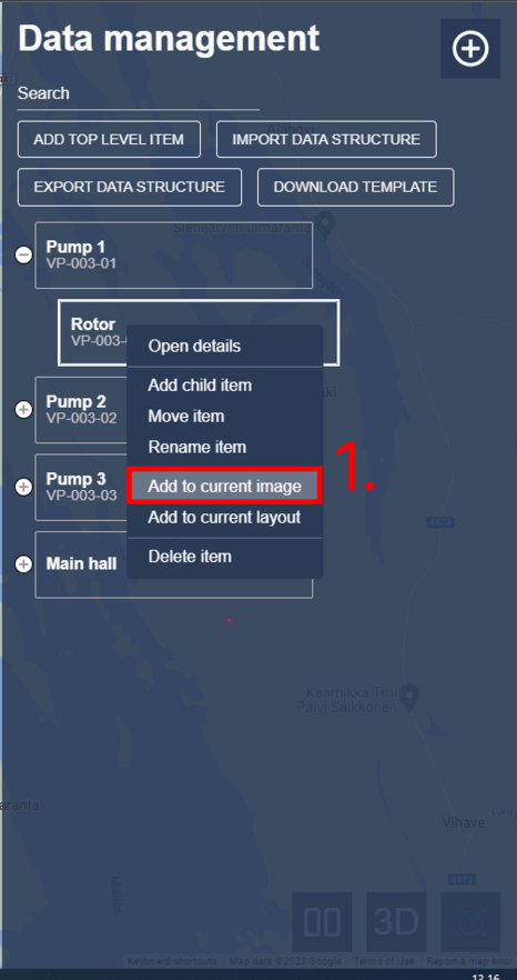
Adding a data item to an image as a POI
Adding a data item to an image as a POI will allow you to open the data item details view from the image and locate the target from data management and item data listing. Navigate to the image where you want to add the data item. Then open data management and right click on the desired data item to open a context menu. Then click on “Add to current image” (1).
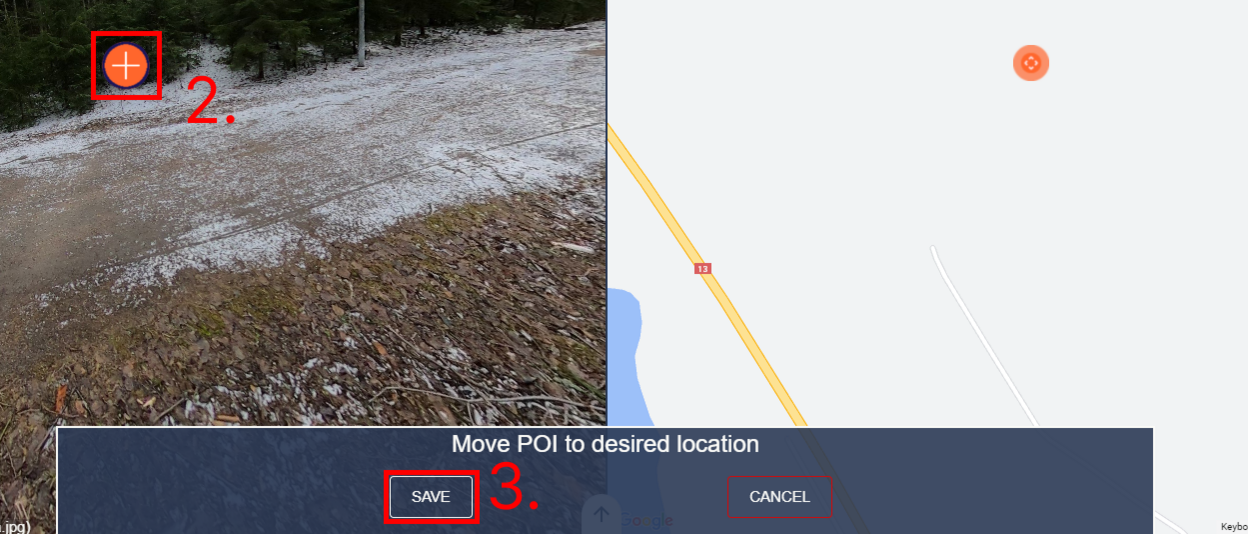
This will open the POI placement view. Your new POI will appear in the middle of the image view as a plus icon with blue borders (2). Move the POI to the desired location by dragging the image view.
You can also use the W, A, S and D buttons on your keyboard to rotate the image. You can also set the zoom level by using your mouse scroll wheel.
When the POI is located, the view will be set to the same zoom level that was set during this phase. After you have set the desired location and zoom level press “Save” (3) on the bottom.
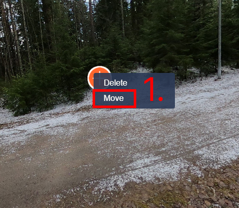
Moving a data item POI
Right click on a data item POI to open a context menu. Click “Move” (1) to start the moving process. Drag the POI to the desired location and zoom.
You can also use the W, A, S and D buttons on your keyboard to rotate the image.
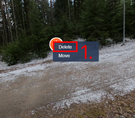
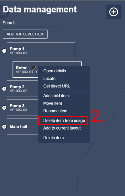
Deleting a data item POI
There are two ways to delete a data item POI. First way is to right click on a data item POI to open a context menu and then clicking “Delete” (1).
If you are in an image that contains a POI of a certain data item you can also delete it from data management by right clicking on the data item and selecting “Delete item from image” (2).
Note that if the current image does not contain a POI for the data item you will see “Add to current image” instead.
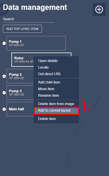
Adding a data item to a layout as a POI
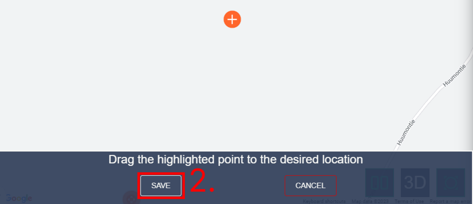
Open the layout that you want to add the data item to. Right click on the data item that you want to add and select “Add to current layout” from the context menu (1).
A green POI with orange borders will appear in the layout (2). Move the POI to your desired location and click “Save” at the bottom of the screen (3).

Moving a data item POI in the layout
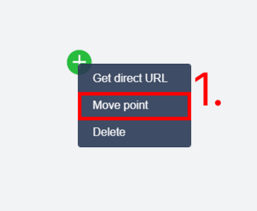
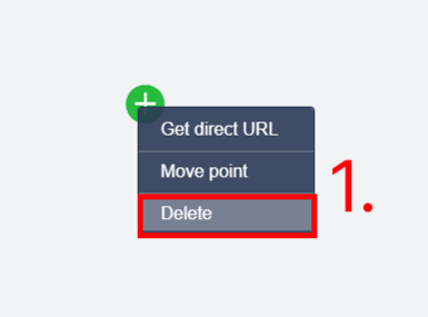
Open the layout that contains the desired data item POI. Right click on the data item POI and select “Move point“ from the context menu (1).
Drag the POI to your desired location and click “Save” on the bottom of the screen (2).
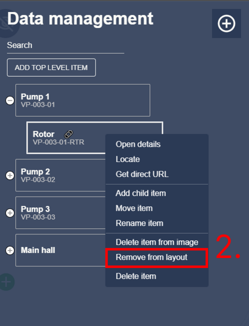
Deleting a data item POI from the layout
There are two ways to delete a data item poi from the layout. Either right click on the data item POI on the layout and select “Delete” from the context menu (1) or open data management, right click on the data item and select “Remove from layout” from the context menu (2).
Data item details
You can open the data item details by double clicking a data item in data management, by right clicking a data item in data management and selecting “Open details” or by opening a POI from an image.
Content that is added to the details view is called “item data”.
Adding documents, images and videos
You can upload any file under the “documents” section and only selected media types under “images & videos” section. “Images & videos” section will accept following file types: .jpg, .jpeg, .png, .gif, .mp4, .webm and .mov. Note that only files added in “images & videos” section will open in the LightBox view.
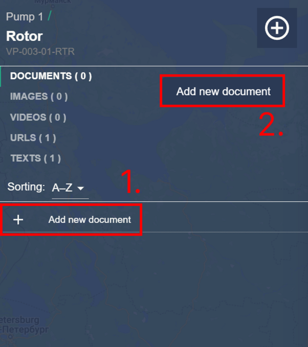
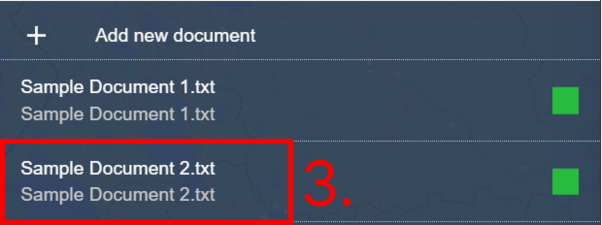
Open the desired section from the tab menu and click “Add new xxx” from the content area (1). You can also right click on a tab to open a context menu instead (2). You can upload multiple files at a time.
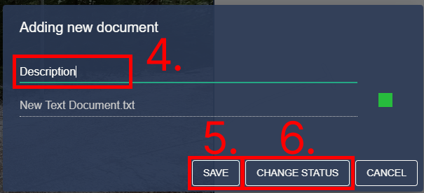
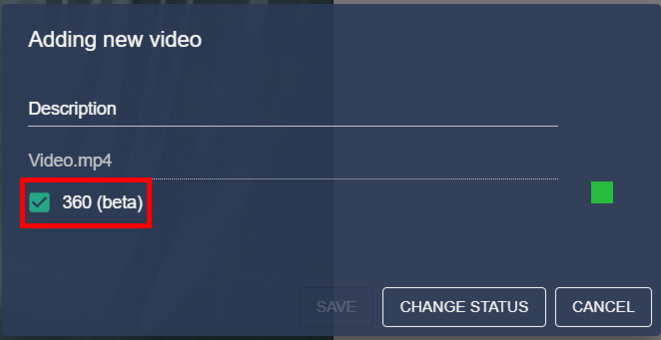
If you select multiple files they will be automatically added with the file name as a description (3). If you only select one file you will be taken to the edit dialog (4). You must set a description for the file you are adding. You can also change the status/importance of the file by clicking “Change status” (5). When you are ready click “Save” (6).
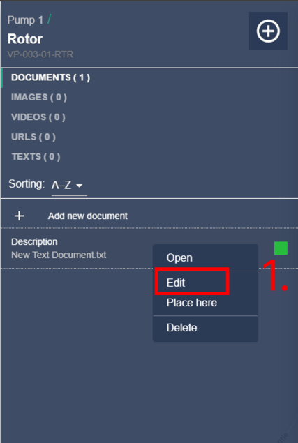
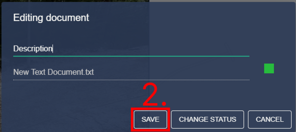
Editing documents, images and videos
Right click on an added file to open a context menu. Click “Edit” (1) to open the edit dialog. You can change the description and status/importance of the file. Click “Save” (2) to apply the changes.
Video formats and 360 videos
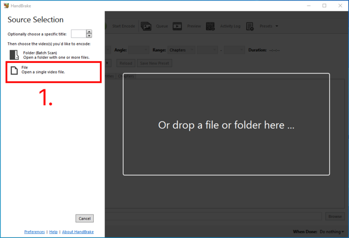
We recommend that you re-encode all your videos before uploading them to the service. Re-encoding ensures that the videos are as compatible as possible and reduces the size of the files.
We use HandBrake to re-encode our videos (www.handbrake.fr). Please install this program if you want to follow our recommended re-encoding practices. After you have re-encoded your videos you can upload them to our service.
360 videos
As you are adding or editing a video you can choose to add the “360” checkmark to the file. Adding this checkmark changes the video player that the video will be played in.
Using HandBrake to re-encode videos
Select a file from your computer
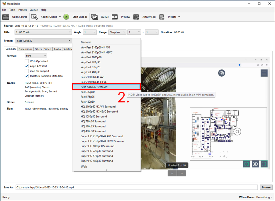
Select “General” -> “Fast 1080p30” from the preset dropdown
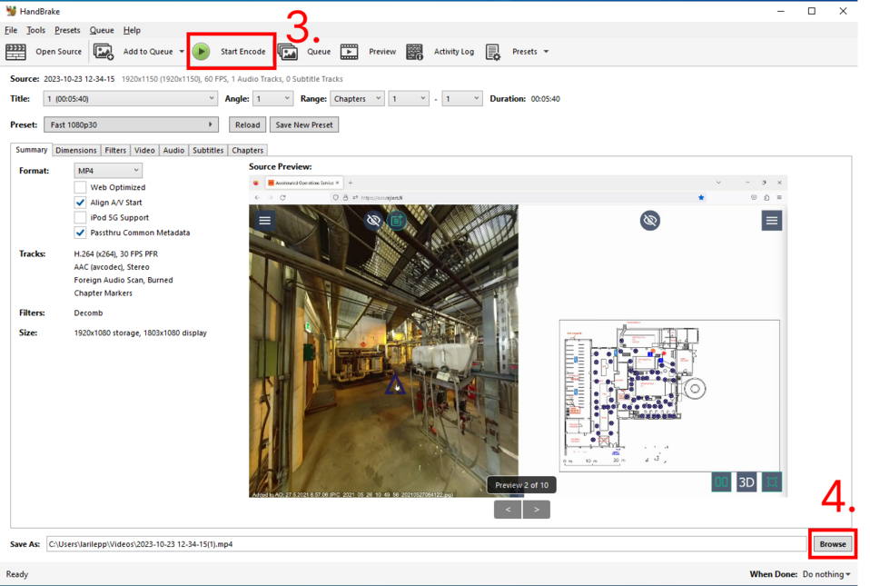
Select “Start Encode” (3) . If you want to change the name or location of the re-encoded video click “Browse” (4).
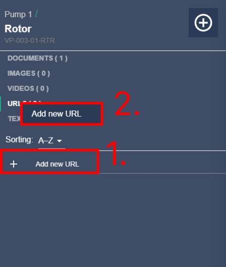
Adding URLs
Open the “URLs” section of the data item details and click “Add new URL” (1) or right click on the “URLs” tab to open a context menu (2) to add a new URL.
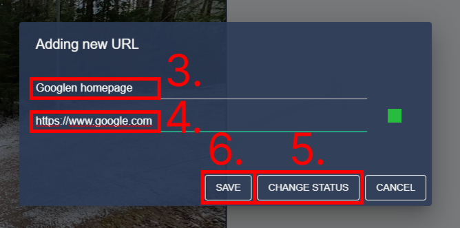
This will open the URL edit/add dialog. Set a description for your new URL (3) and add the URL target (4). We suggest that you add the full URL as a target to make sure the URL works.
For example "https://www.google.com" instead of "google.com". You can also set the status/importance of the URL by clicking “Change status” (5). When you are ready press “Save” (6).
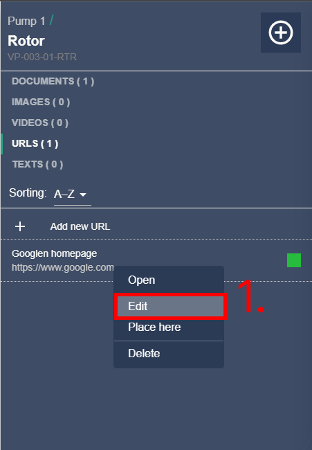
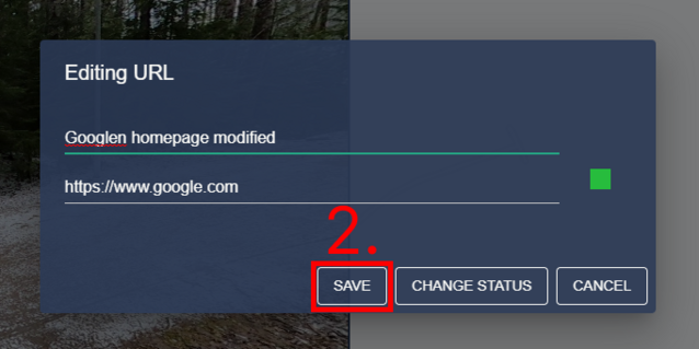
Editing URLs
Right click on an added URL to open a context menu. Click “Edit” (1) to open the edit dialog. You can change the description, target and status/importance of the URL. Click “Save” (2) to apply the changes.
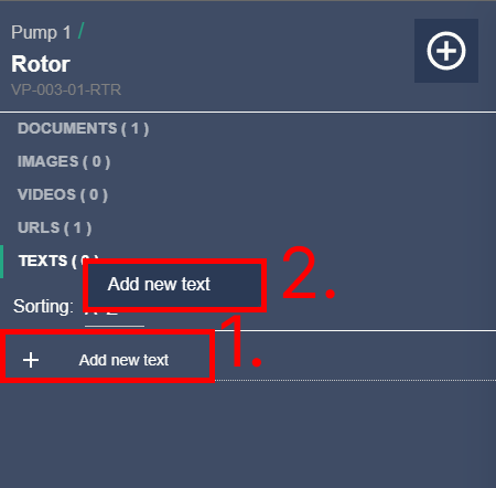
Adding texts
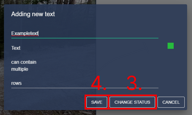
Open the “texts” section of the data item details and click “Add new text” (1) or right click on the “texts” tab to open a context menu (2) to add a new text. This will open the text edit/add dialog. Write a header and a body for your text entry in the given fields. The body field is a multi-line type so you can press return/enter to add a new line. You can also set the status/importance of the text by clicking “Change status” (3). When you are ready press “Save” (4).
Editing texts
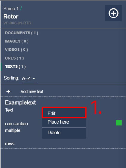
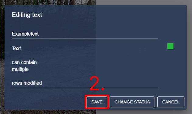
Right click on an added text to open a context menu. Click “Edit” (1) to open the edit dialog. You can change the header, body and status/importance of the text entry. Click “Save” (2) to apply the changes.
Placing item data to an image as a POI
You can specify locations for any data item detail type. This can be helpful for example, when pointing out specific parts of a target for documents or placing 2D images in an image. Item data placements can be located from data item details or item data listing. Item data placements will persist on images until a different tab is selected in data item details or another data item is opened.
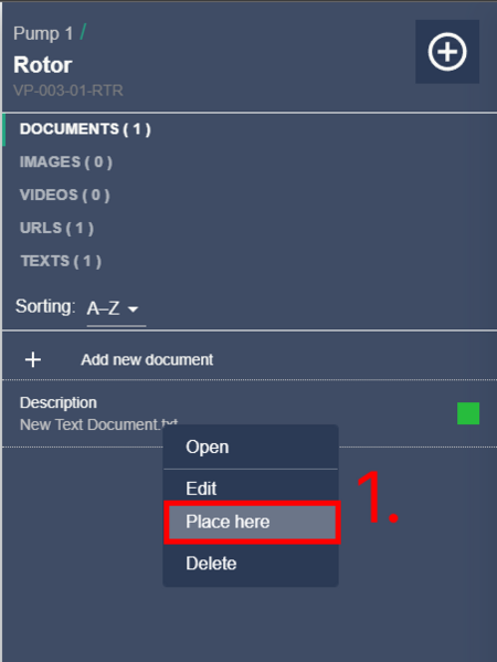
Right click on any item data to open a context menu and select “Place here” (1). This will open the POI placement view. Your new POI will appear in the middle of the image view as a blue dot icon (2).
Move the POI to the desired location by dragging the image view. You can also use the W, A, S and D buttons on your keyboard to rotate the image.
You can set the zoom level by using your mouse scroll wheel. When the POI is located, the view will be set to the same zoom level that was set during this phase.
After you have set the desired location and zoom level press “Save” (3) on the bottom.
Editing an item data placement POI
If a certain item data has been added to an image as a POI you can edit it afterwards. You can find the correct image easily by locating the item data first.
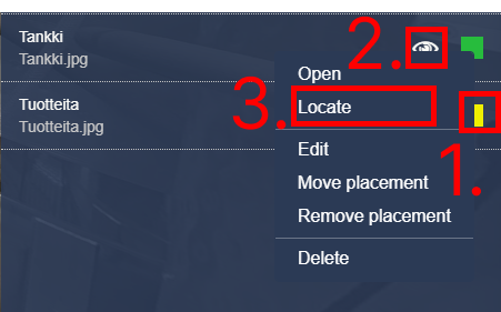
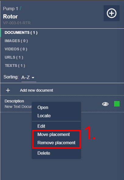
Right click on the item data in data item details. This will open a context menu with options “Move placement” and “Remove placement” (1).
You can remove the placement in that specific image by clicking “Remove placement”. If you want to move the placement click, “Move placement” and you will be brought to the POI placement view once again.
Deleting an item data
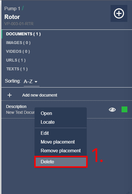
Right click on an item data to open a context menu and click “Delete” (1).
Markers
Adding a new marker to an image
Navigate to the image that you want to add the marker to. User can add markers using two different methods:
- Press secondary mouse button / right click,
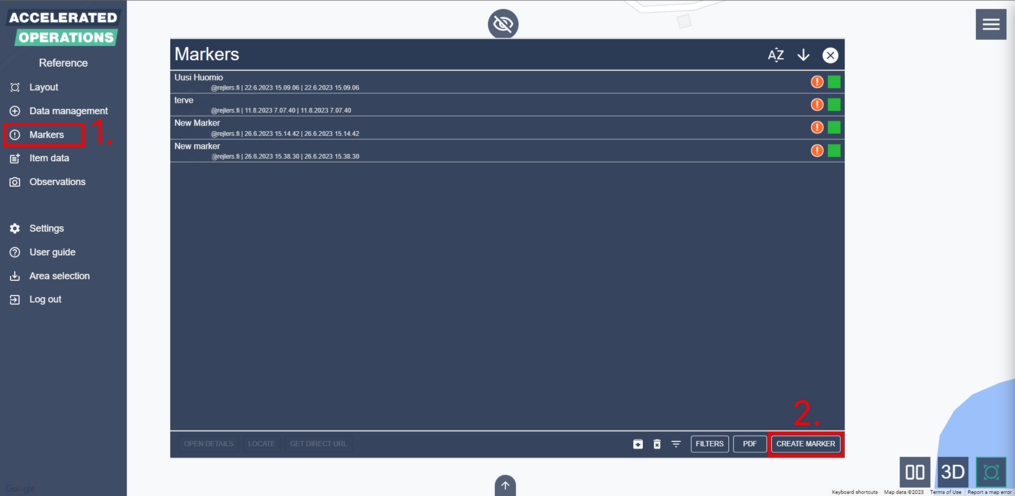
- Open marker list view by clicking “Markers” from the main menu (1).
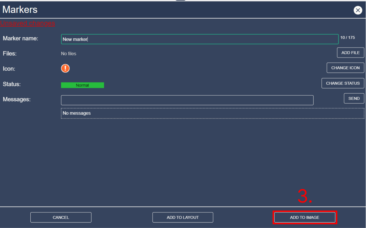
Pressing secondary mouse button opens context menu with "Create marker" option. If the latter method is chosen, click “Create marker” (2) from the bottom right of the marker list view. This will open the marker creation view. In the marker creation view you must set a description/name for the marker (1) before continuing.
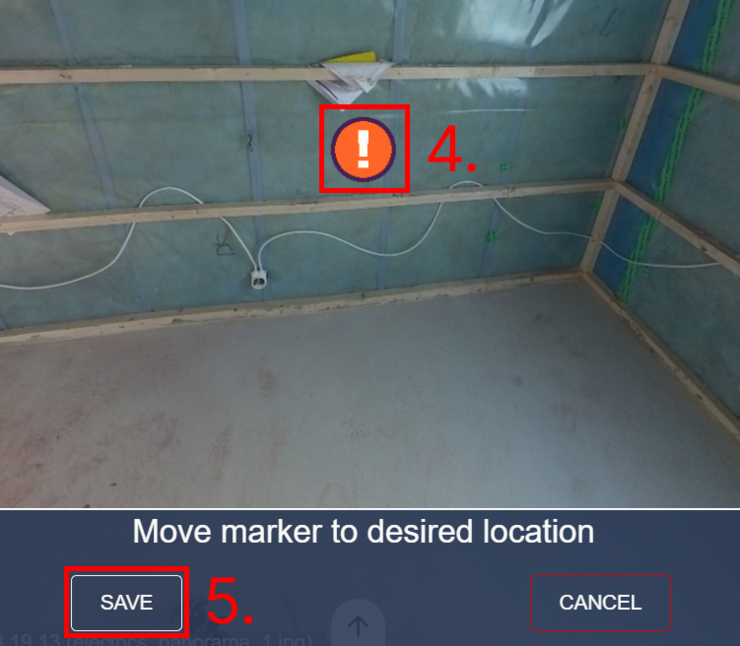
You can also set the icon, status, add files or messages from the marker creation view. After you have set the marker data press “Add to image” (3). After you click save the POI placement view will open.
Drag the image view to move the marker icon (4). You can also use the W, A, S and D buttons on your keyboard to rotate the image. When you are ready click “Save” again (5).
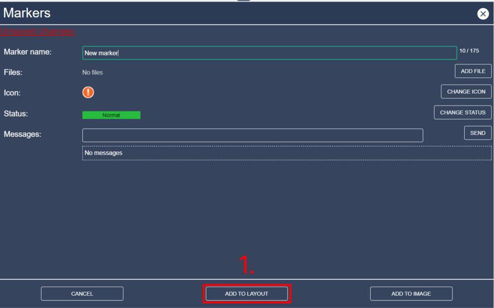
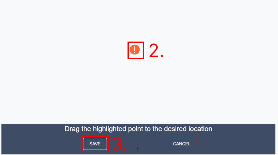
Adding a marker to a layout
Follow the same steps as you did when adding a marker to an image, except after giving the marker details press “Add to layout” (1).
A pink marker icon with orange outlines will appear in the layout view (2). Drag the marker icon to your desired location and click “Save” from the bottom of the screen (3).
Editing or deleting a marker
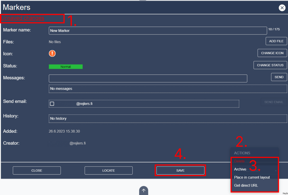
Click on a marker from image or marker listing. This will open the marker details. From here you can see if you have unsaved changes (1).
You can edit the marker name, add or delete files, change the icon or status, send messages, delete your own messages, send mail to selected contacts and scroll through the editing history of the marker.
This happens in the main area (2). You can also delete the marker, set the marker as archived, place the marker in the current image/layout or get a direct URL pointing to the marker (3). If you have unsaved changes (1) click “Save” (4) to send the changes to server.
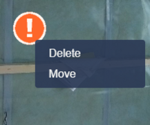
You can also delete or move a marker by right clicking on it in image, layout or via markerlist and then selecting “Delete” or “Move/Move Point” from the context menu.
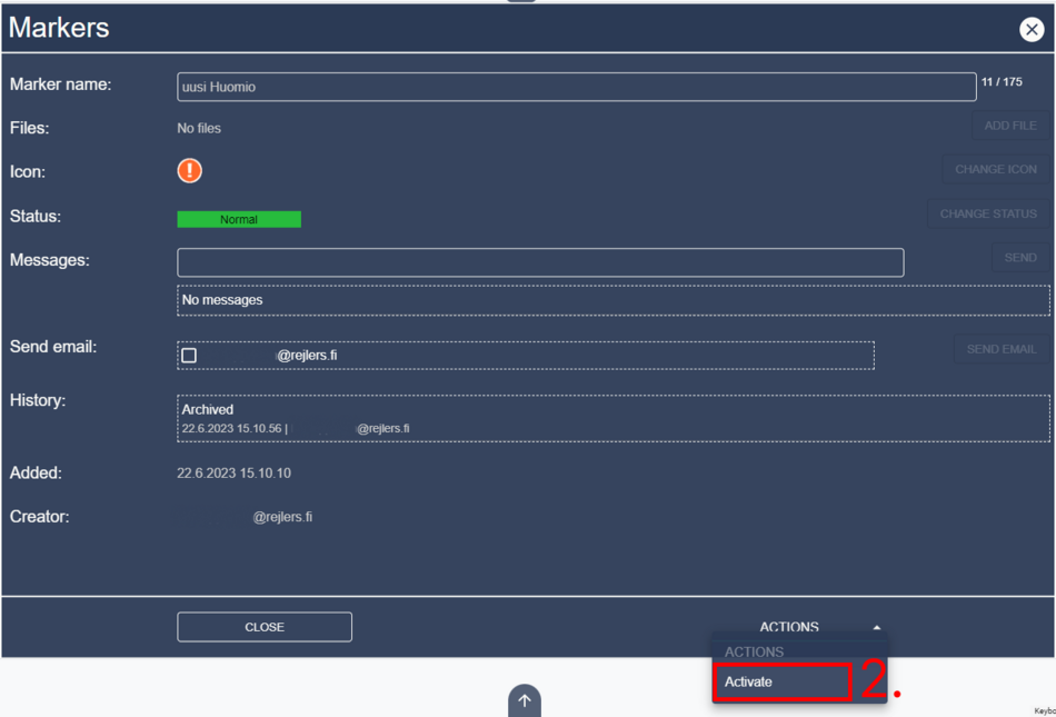
Archiving and restoring archived markers
To see activated markers just open the marker listing. To see archived markers, click “Show archived” button in the marker listing (1).
You can then switch back to activated markers by clicking “Show active” in the same area as “Show archived” was. To archive or activate the marker, open marker details and click on “Actions” in bottom right (2).
If the marker is archived, you will see “Activate” and if it is not you will see “Archive”.
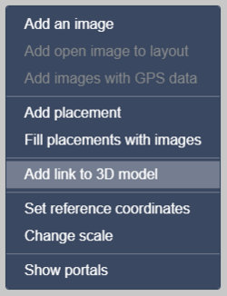
Adding 3D links
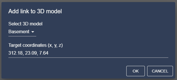
You can link the area’s Potree pointclouds to 360 images and layout images by right-clicking the image and selecting “Add link to 3D model”.
In the dialog that opens select the model from the dropdown menu and input coordinates (in x, y, z format).
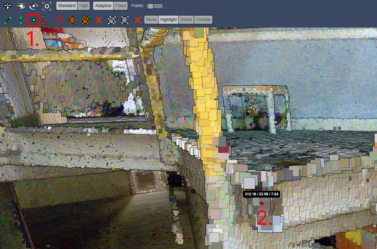
You can get the coordinates from the 3D viewer by using the Point measurement tool (third from the left in the bottom row).
Mobile features
Some UI elements can only be found in the mobile version of Accelerated Operations Service. This is to improve user experience in mobile devices.
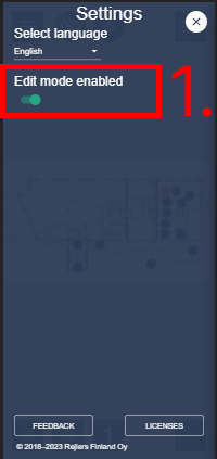
Edit mode
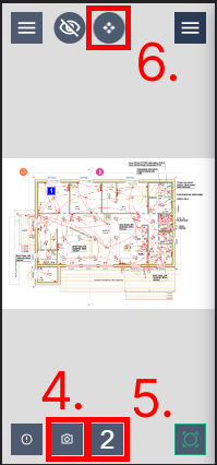
Edit mode is enabled by default. You can turn it off from settings by tapping “Edit mode enabled” (1). Depending on your user level you will see different buttons enabled in image/layout views.
Add marker (2), open previous image (3), add image (4), add placement (5), enable move mode (6). If you enable move mode you can move the points in layouts by tapping on them.